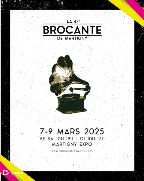
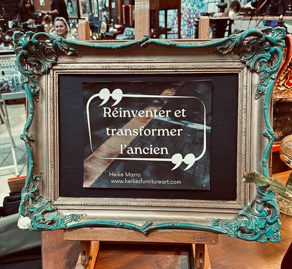
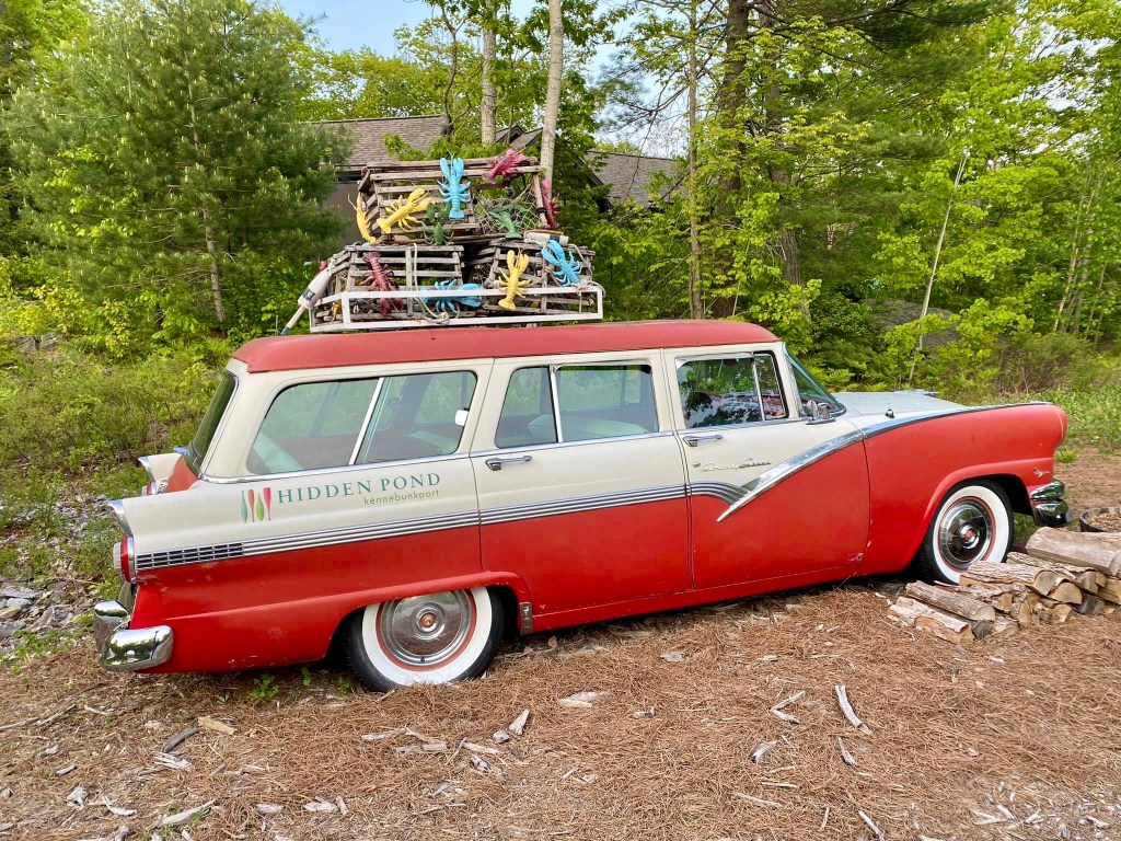
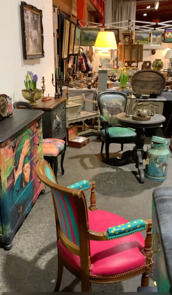
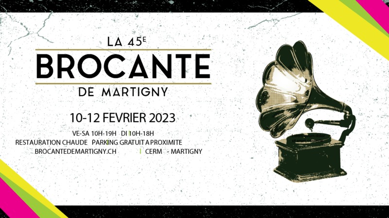
Après Bulle c’est le tour à la Brocante de Martigny/Valais où me trouver avec mes meubles et objets transformés.
La Brocante de Martigny se déroule le weekend du 7 au 9 mars 2025 dès 10heures. Je serais vraiment heureuse de vous y accueillir et de partager avec vous mon aventure et univers créatif.
Qu’est-ce qui vous attend ? Des nouveautés « of course » (pour ceux qui sont venus à Bulle) et en général
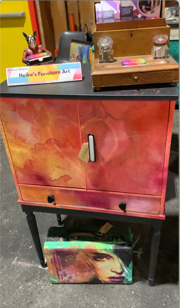
👀 meubles relookés, décalés, avec une touche d’originalité.
👀 Des meubles et objets métamorphosés pour leur donner une âme nouvelle.
👀 Une grande dose d’inspiration pour votre intérieur.
👀 LA pièce parfaite que vous cherchiez depuis toujours ! 🙃😉
Et peut-être… votre coup de cœur à prendre avec vous lors de votre visite ! 🤩🥳
A bientôt?! Heike
English:
Are you looking for unique, quirky objects that have been transformed with passion and tell a story?
Then the Brocante de Martigny/Valais is the place to find me and my restyled furniture and objects.
The Brocante de Martigny takes place on the weekend of March 7 to 9, starting at 10 a.m. I’d be delighted to welcome you there and share my adventure and creative universe with you.
What’s in store? New products of course (for those who visited me in Bulle already) 😉 and in general
👀 furniture with a new look and a touch of originality.
👀 Furniture and objects transformed to give them a new soul.
👀 A big dose of inspiration for your interior.
👀 THE perfect piece you’ve always been looking for! 🙃😉
And maybe… your favorite to take with you on your visit! 🎉🤩
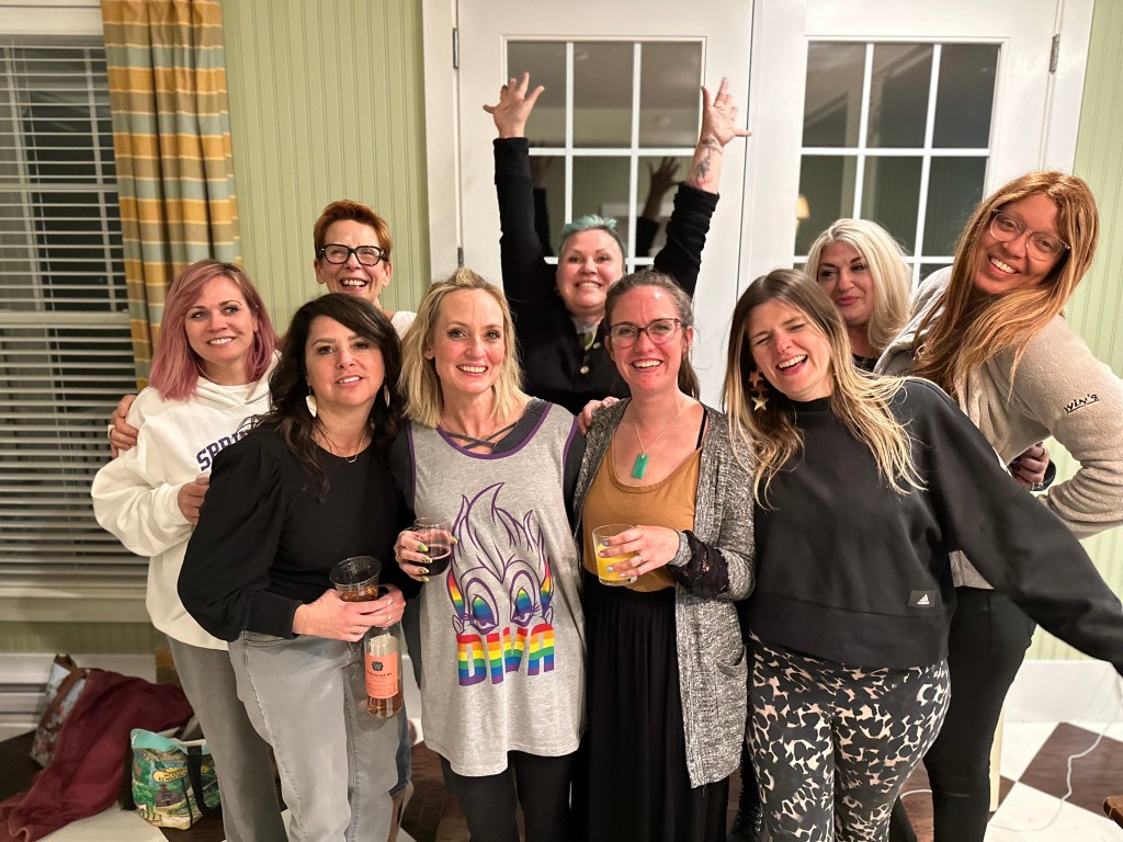
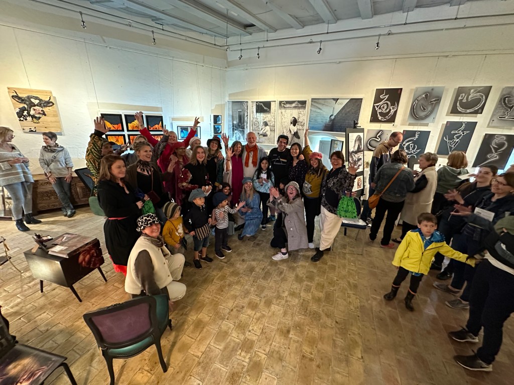
La Brocante de Bulle 2024 s’est terminée hier à 17h.
Ce fût une expérience incroyable pour moi. C’était tellement riche en rencontres et échanges aussi brefs qu’ils aient été pour certains.
Il n’y avait pas une minute d’ennui pendant 3 jours consécutifs, …jusqu’à la dernière minute (le dernier achat s’est fait à 17h15 quand on commençait à ranger 😅 🧡)
Vous avez tous réussi à mettre un immense sourire sur mes lèvres et à me sentir valorisé par vos mots et gestes et il m’importe beaucoup de remercier par ce biais toutes les personnes qui y ont contribuées.
Tout ce monde incroyable qui s’est arrêté à mon stand pour me dire Bonjour, ou en passant tout simplement faire un petit sourire ou un signe d’encouragement 👍🏻👏🏻 Ceux qui ont pris le temps de me dire qu’ils aiment mes créations, me complimenter sur leur originalité et caractère unique. Pour me féliciter sur l’émission Bon Débarras du 19 janvier 2024 dans laquelle j’ai eu l’immense privilège de participer.
Pour les rires et discussions, les échanges sur divers thèmes allant du relooking en général, aux techniques que j’utilise et au-delà de ça. Je suis tellement reconnaissante pour ces moments. MERCI !
Un tout grand merci à ceux et celles qui sont tombés amoureux d’une création sortant un peu de l’ordinaire et de l’avoir dans leur intérieur. Je vous souhaite beaucoup de plaisir avec votre pièce !
Cette vidéo a été tournée avant le début de la Brocante lors de l’installation et tout simplement pour vous donner un petit aperçu. Il y a eu pas mal de changements au cours des 3 jours 😅🙃
Et si le cœur vous en dit….je serai à la Brocante de Martigny au CERM du 23 au 25 février
Une magnifique journée à vous tous, Heike
English version
The Brocante de Bulle 2024 (antique fair) ended yesterday at 5pm.
It was an incredible experience for me. It was so rich in encounters and exchanges, however brief they may have been for some.
There wasn’t a dull moment for 3 consecutive days, right up to the last minute (the last purchase was made at 5.15pm when we were starting to tidy up ).
You all managed to put a huge smile on my face and make me feel valued by your kind words and gestures.
I’d like to take this opportunity to thank everyone who contributed to all of this. Everyone who stopped by to say hello, or simply gave me a smile or a thumbs-up 👍🏻 👏🏻 Those who took the time to tell me they love my creations, to compliment me on their originality and uniqueness. For congratulating me on the Bon Débarras show of January 19, 2024, in which I had the immense privilege of participating.
For the laughs and discussions, the exchanges on various themes ranging from makeovers and restyling in general, to the techniques I use and beyond. I’m so very grateful for these moments. Thank you so much!
Many thanks to those of you who have decided to purchase one of my creations and wanted something a little out of the ordinary for their interior. I hope you enjoy your piece!
And if you feel like it….I’ll be at the Brocante de Martigny at CERM from February 23 to 25
Une Année hors du commun : Rencontres inoubliables, Opportunités extraordinaires, Cours donnés à l’étranger, Émission Télévisée, Expositions à travers la Suisse et Une collection de sacs à main….
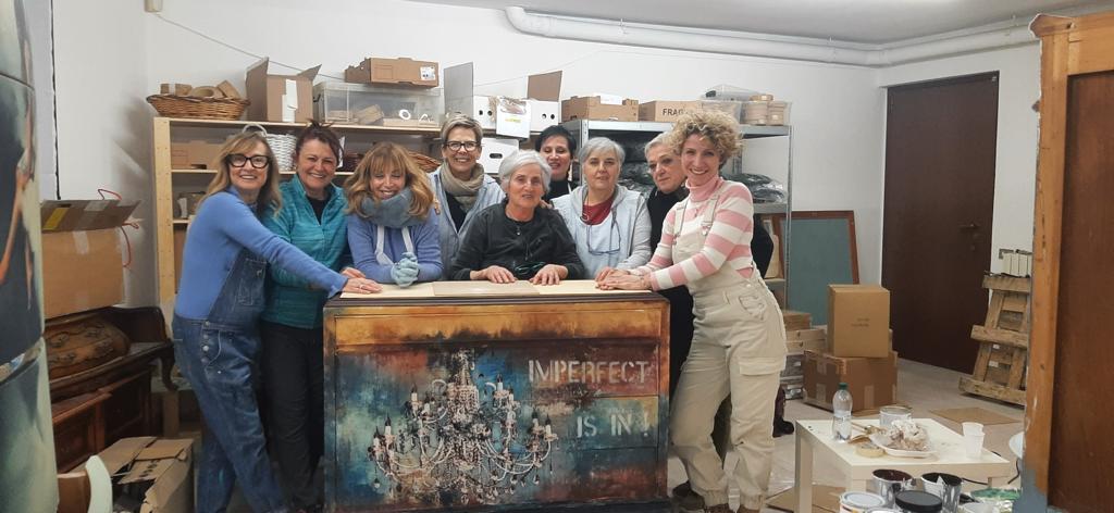
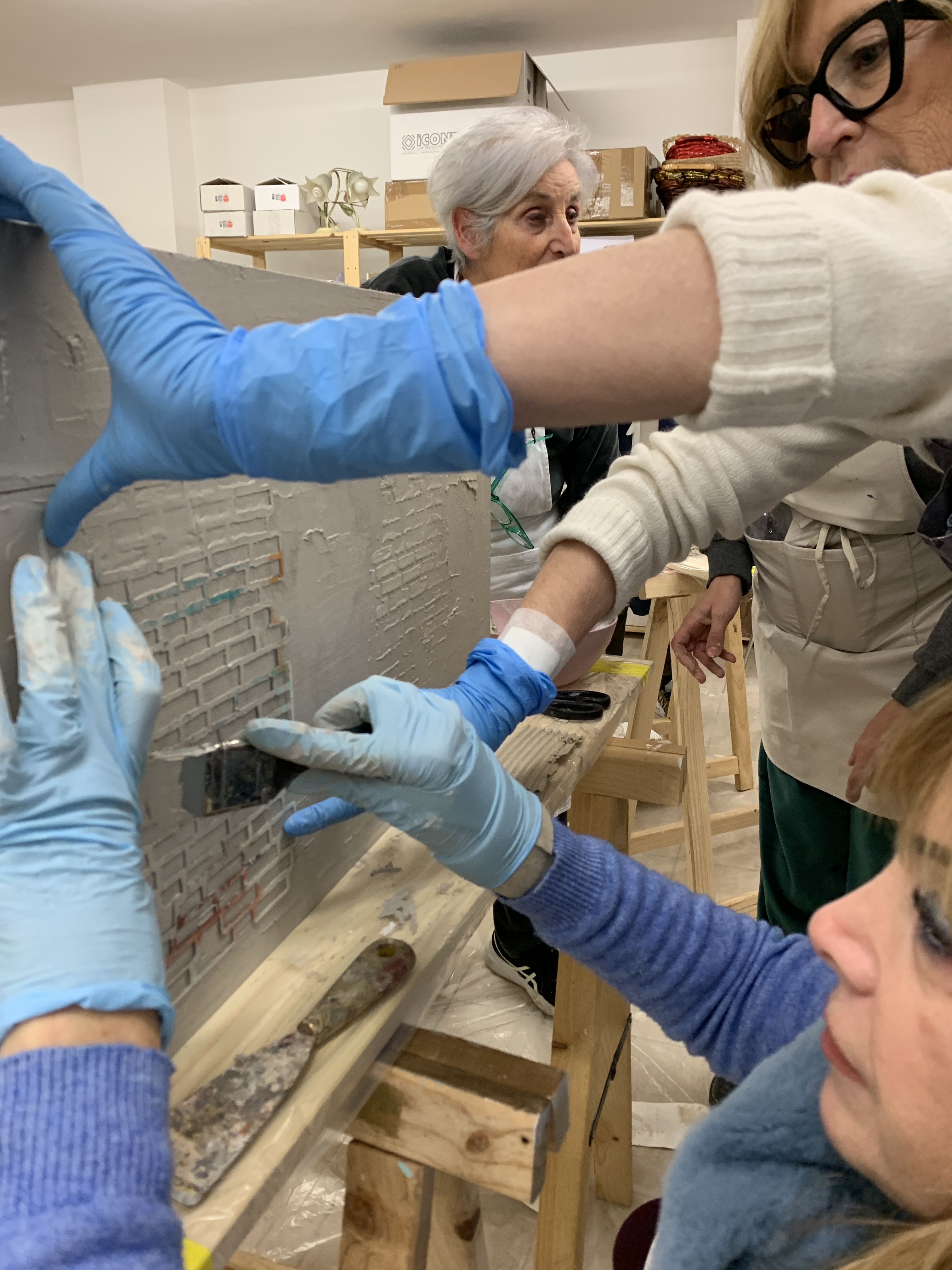
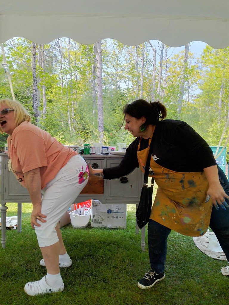
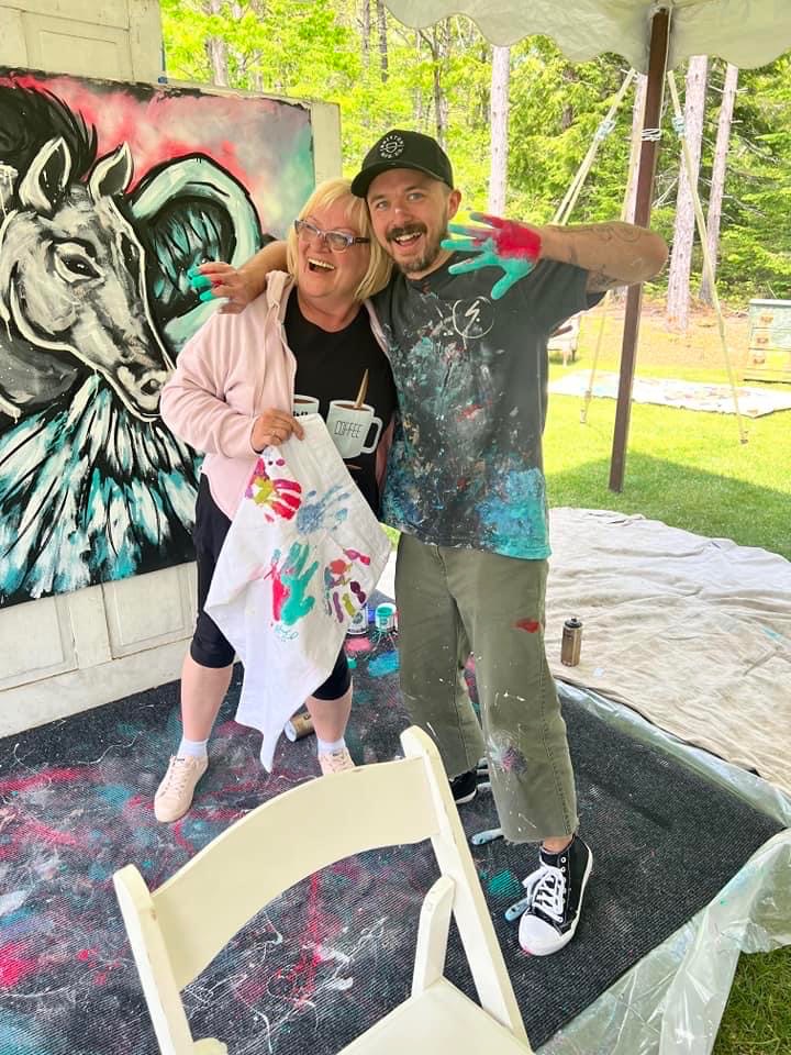
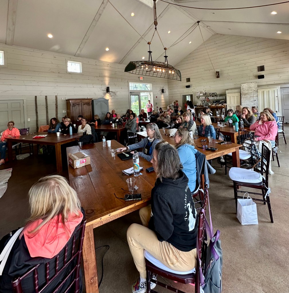
L’année 2023 s’est révélée être bien plus qu’une simple année artistique et créative. Elle a été une période extraordinaire marquée par des moments magiques et des expériences mémorables. En tant qu’artiste passionnée, j’ai eu la chance de passer des moments inoubliables en Italie, aux États-Unis et en Allemagne pour partager ma passion à travers des ateliers et workshops et des rencontres exceptionnelles. Certains de ces liens sont devenus des amitiés pour la vie, des personnes qui ont enrichi non seulement mon parcours artistique mais aussi ma vie personnelle.
J’ai eu l’opportunité de partager mon savoir-faire avec un public diversifié dans des workshops que j’ai animés ici ou à l’étranger. Les participants ont non seulement appris de nouvelles techniques, mais ont également contribué à enrichir ma propre personne d’une manière ou d’une autre. Ils ont permis d’échanger des idées créatives avec des artistes locaux tout en découvrant la beauté culturelle du pays et de ses habitants. Quelle découverte !
Allemagne en Juin 2023 – Merci Vanessa et Olli ( je leur attribue le prix des “meilleurs hôtes et organisateurs” ) https://www.facebook.com/SimplyVintageWeiher. Aussi, leurs “pool parties” sont légendes – shhhhh🤫😅🥳
Cette année a laissé une empreinte indélébile sur mon parcours en tant qu’artiste et sur ma personne tout court.
Les expositions ont été un pilier essentiel de cette année exceptionnelle. Les expositions locales à travers la Suisse ont été l’occasion de présenter mes créations à un public plus proche de chez moi. Chaque œuvre présentée était le fruit de mon engagement et de ma passion. Elles m’ont permis de rencontrer des personnes passionnées et passionnantes. Les rencontres avec des clients qui ont acquis mes œuvres décalées et sortant de l’ordinaire ont été tout aussi enrichissantes. Merci!
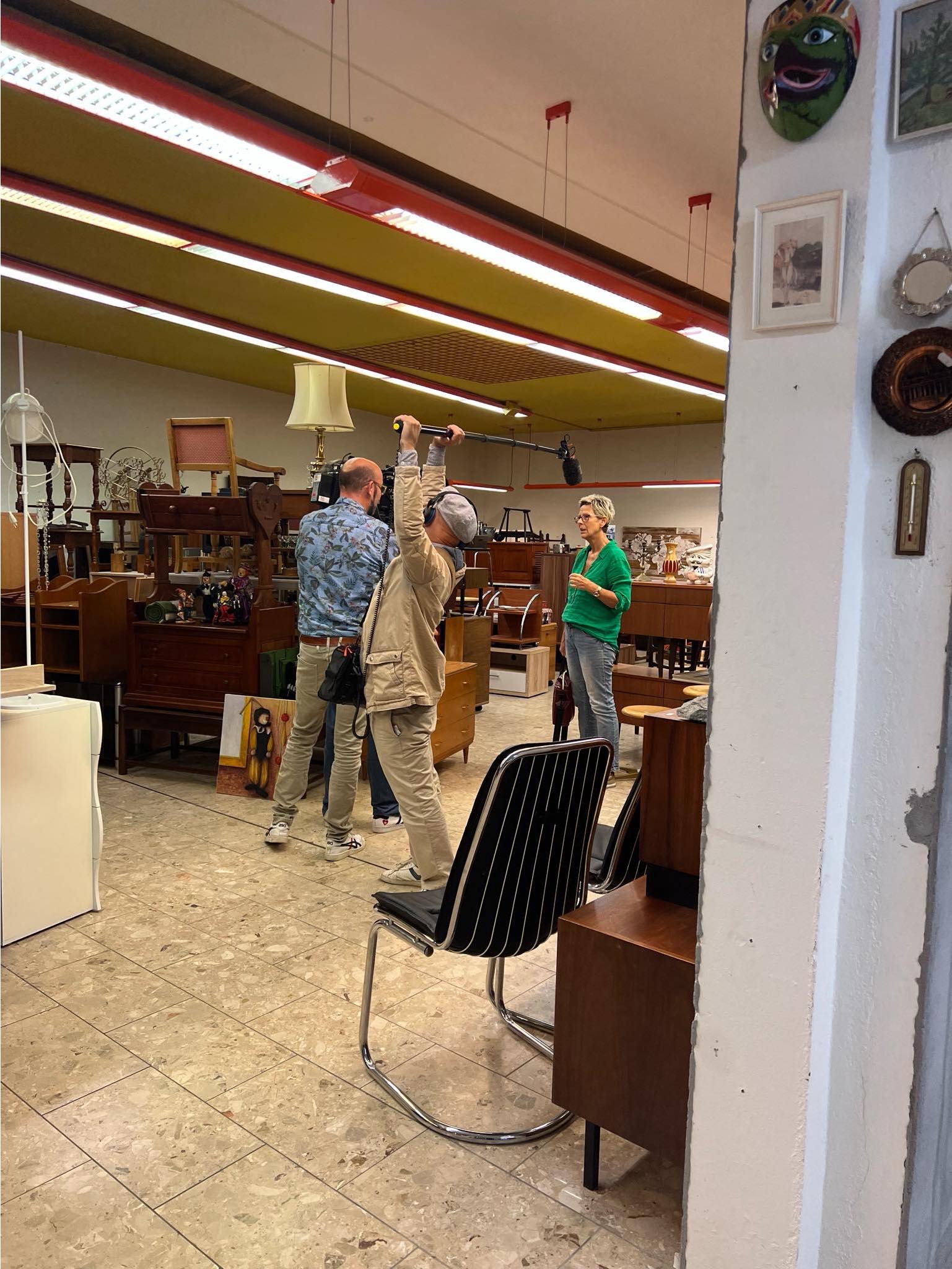
L’un des moments les plus excitants de l’année a été ma participation à l’émission “Bon Débarras” de la RTS (télévision Suisse Romande). Le tournage a été une expérience incroyable. J’attends avec impatience la diffusion prévue le 19 janvier 2024 sur https://www.rts.ch/play/tv/emission/bon-debarras-?id=11675511 et de pouvoir partager cette aventure avec ma famille, mes amis et tous ceux qui me suivent. Même moi je vais la découvrir qu’à cette date là. Marquez vos calendriers pour ne rien râter! 😃🥳
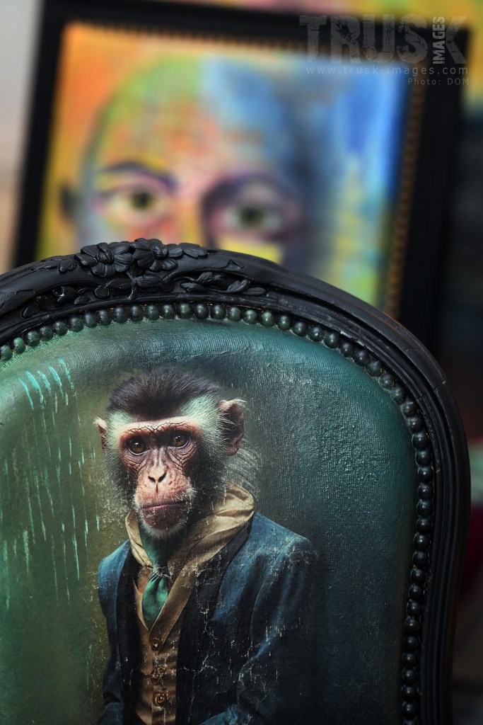
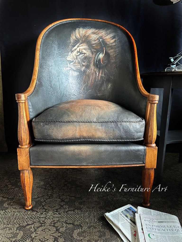
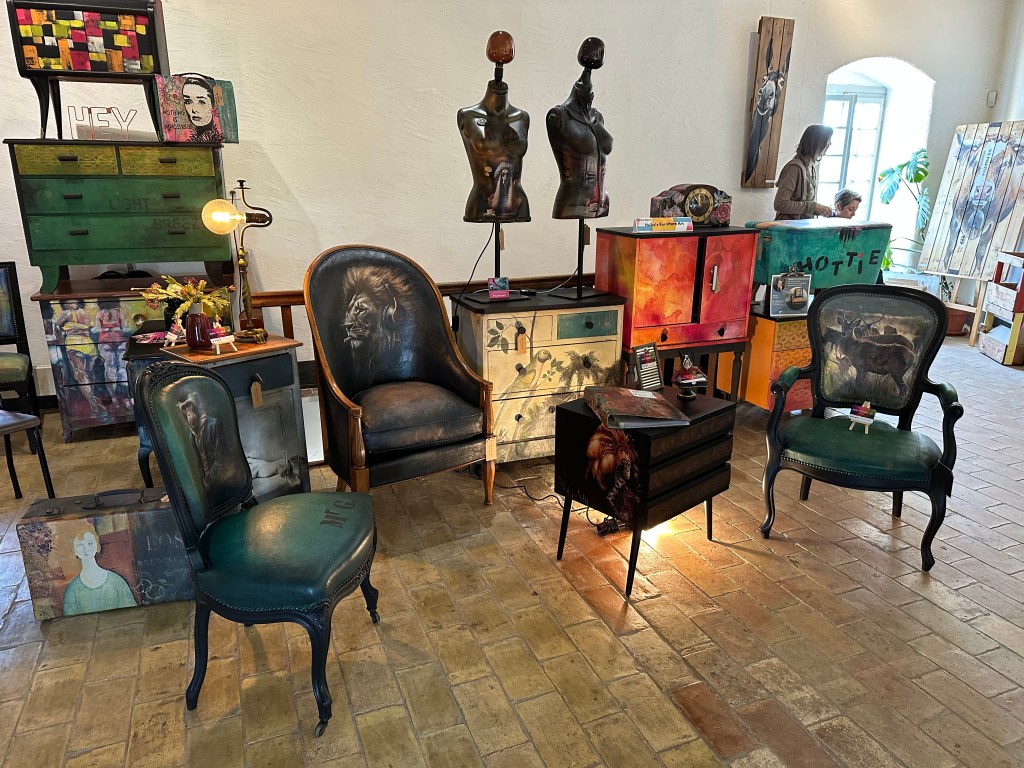
Fauteuils et chaises m’ont conquis et étaient au premières loges en terme de créations pour moi cette année. Si le coeur vous dit d’aller regarder et découvrir les différentes pièces décalées et originales créées, alors cliquez ici https://heikesfurnitureart.com/fauteuils-chaises-decales/
Guidant les participants à travers le processus, j’ai partagé les secrets de la transformation d’un simple fauteuil désuet en une pièce originale et expressive. Les participants ont créé de fabuleux fauteuils uniques suite à ce cours. Voir ci-dessous quelques exemples.
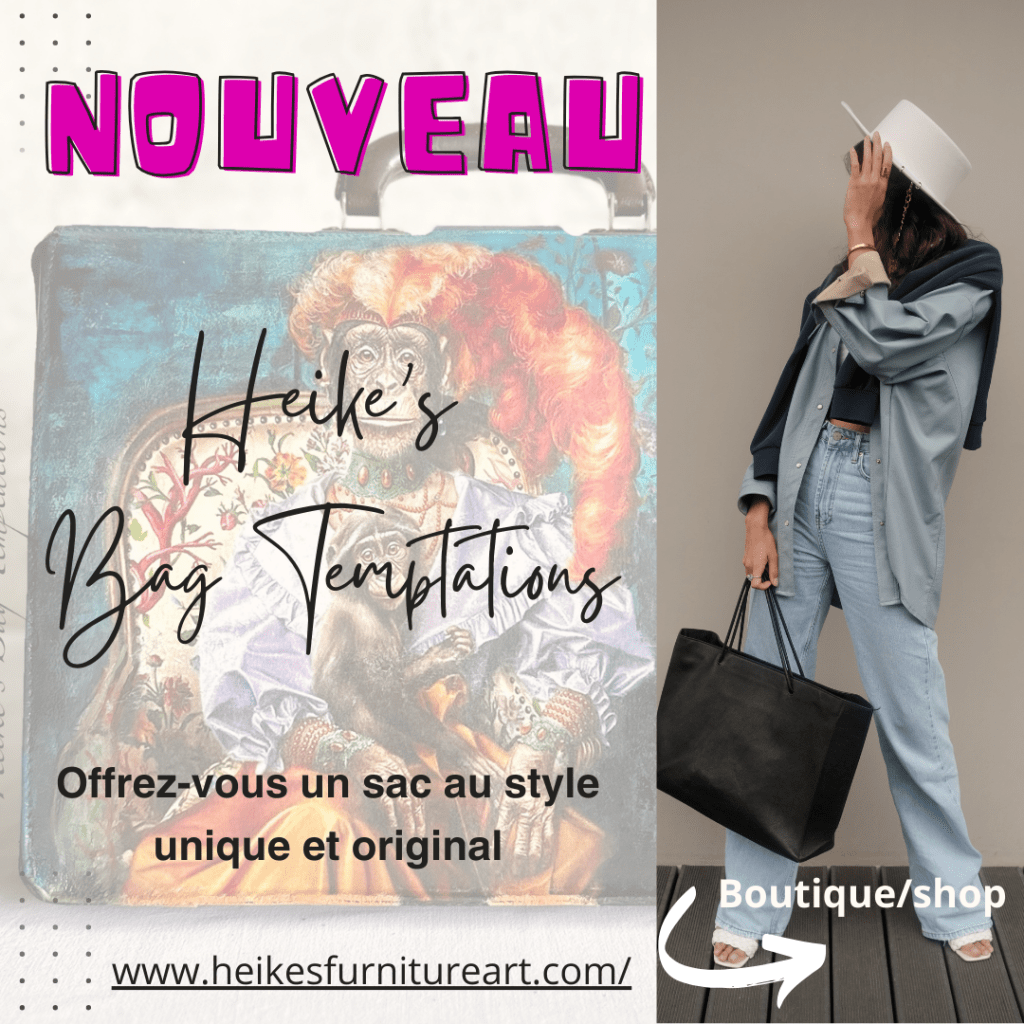
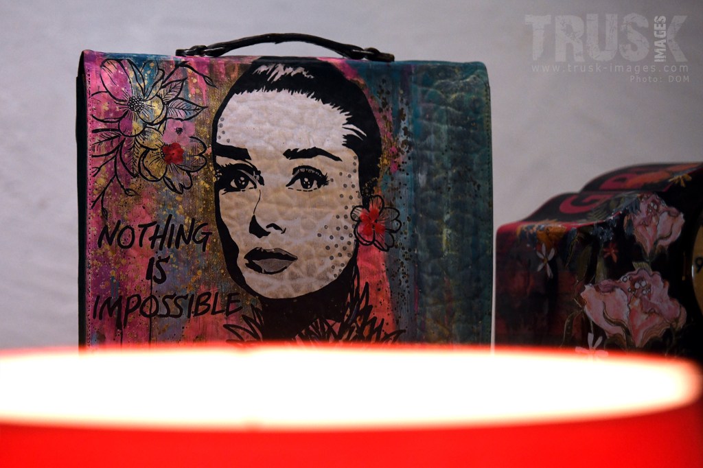
De plus, une collection de sacs à main « Heike’s Bag Temptations », caractérisée par son éclectisme a vu le jour. Chaque pièce est imprégnée d’une originalité décalée, avec des couleurs vives et des designs uniques. Une étape importante a été franchie avec la possibilité d’envoyer mes créations à l’étranger. Cela ouvre de nouvelles opportunités pour partager mon travail avec un public international. Cliquez ici: https://heikesfurnitureart.com/heikes-bag-temptations/
En rétrospective, l’année 2023 a été une aventure complète, allant au-delà des frontières pour des moments excitants et des amitiés. Elle restera gravée dans ma mémoire comme une période magique, pleine de découvertes, de rencontres inspirantes et qui mon touchées profondément.
Alors que 2024 se profile à l’horizon, je suis empli de gratitude pour ces expériences et toutes les rencontres faites. Je suis reconnaissante pour chaque moment partagé et j’attends avec impatience les nouvelles aventures que l’avenir me réserve. Merci de faire partie de cette aventure.
Merci d’être avec moi, pour votre amitié, de me soutenir, de m’inspirer, pour tous vos messages d’encouragement, d’égayer mes journées avec vos commentaires, de me faire sourire, de vous préoccuper tout simplement. Cela me touche énormément. Une magnifique année 2024 à vous! Heike 🧡
English version without photos – please check them above for each theme
A Year Out of the Ordinary: Unforgettable Encounters, Extraordinary Opportunities, Courses Abroad, TV Program, Exhibitions Across Switzerland and A Handbag Collection….
The year 2023 turned out to be much more than just an artistic and creative year. It has been an extraordinary period marked by magical moments and memorable experiences. As a passionate artist, I had the chance to spend unforgettable moments in Italy, the United States and Germany, sharing my passion through workshops and exceptional encounters. Some of these connections have become lifelong friendships, people who have enriched not only my artistic career but also my personal life.
I’ve had the opportunity to share my know-how with a diverse audience in workshops both here and abroad. The participants not only learned new techniques, but also contributed to enriching my own personality in one way or another. They allowed me to exchange creative ideas with local artists while discovering the cultural beauty of the country and its people. What a discovery!
This year has left an indelible mark on my career as an artist, and on me as a person.
Workshops and exhibitions have enabled me to meet passionate and exciting people. Equally rewarding have been the encounters with customers who have acquired my quirky, out-of-the-ordinary works.
The exhibitions were an essential pillar of this exceptional year. Each work presented in art fairs or vintage/antique fairs was the fruit of my commitment and passion. The local exhibitions across Switzerland were an opportunity to present my creations to an audience closer to home.
One of the most exciting moments of the year was my participation in the RTS (Swiss national TV) program “Bon Débarras”. The shoot was an incredible experience. I can’t wait for the broadcast, scheduled for January 19, 2024 on https://www.rts.ch/play/tv/emission/bon-debarras-?id=11675511, and to be able to share this adventure with my family, friends and all those who follow me. Even I won’t find out what it looks like until then. Mark your calendars so you don’t miss a thing! 😃🥳
Guiding participants through the process, I shared the secrets of transforming a simple outdated armchair into an original and expressive piece. Participants created some fabulous one-of-a-kind armchairs as a result. See some examples above.
A new eclectic collection of handbags, “Heike’s Bag Temptations”, has also been launched. Each piece is marked by a quirky look, with bright colors and unique designs. An important step has been taken with the possibility of sending my creations abroad. This opens up new opportunities to share my work with an international audience. Click here: https://heikesfurnitureart.com/heikes-bag-temptations/
Looking back, 2023 was full of adventures, reaching beyond borders for exciting moments and friendships. It will remain etched in my memory as a magical time, full of discoveries, inspiring encounters and which touched me deeply.
As 2024 looms on the horizon, I’m filled with gratitude for these experiences and can’t wait to see how they continue to shape my journey. I’m thankful for every moment shared and look forward to the new adventures the future holds. Thank you for being part of this adventure.
Thank you for being with me, for your friendship, for supporting me, for inspiring me, for all your encouraging messages, for making my days brighter with your comments, making me smile, caring. It means the world to me. A fabulous year 2024 to you all! Heike 🧡
Vous êtes toujours à la recherche d’un cadeau de Noël original ? Alors c’est peut-être pour vous ! Découvrez des meubles et objets originaux, décalés et uniques, et bénéficiez d’une réduction de 10% lors d’un achat sur mon site !
Christmas time
Are you still looking for an unusual Christmas gift? Then this might be for you! Discover original, quirky and unique furniture and objects, and benefit from a 10% discount when shopping on my website site!
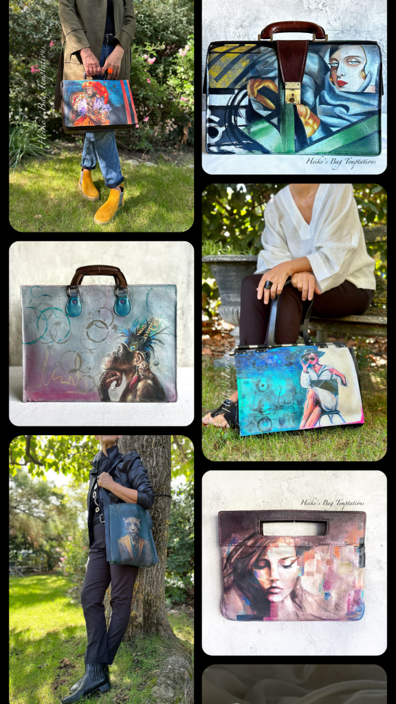
A collection of quirky, eye catching hand bags – Featured by Heike’s Furniture Art
I finally went for it….
I’ve always liked workin on smaller projects like a suitcase or some wall art between my furniture pieces. I loved giving them THAT special treatment aka look using all sorts of techniques.
Then when I created a handbag and posted it on my FB page and showed the how on my youtube channel, a follower suggested to do a collection. Many tuned in and said “yes, you should! They are amazing! I’d love to have one of your bags”.
Well then, here I am… offering a small selection of unique, whimsical vintage or second hand leather or PU leather/faux leather bags with my stamp and take on it. Again with various techniques such as paint, decoupage, stenciling and more. You won’t find any other like it.
Connaissez-vous le salon UniCréa ? Non ? Je vous le conseille vivement. 4 jours immergé dans cet univers qui est UniCréa. 100 artistes ART MODE DECO sélectionnés pour cette occasion qui exposent leurs merveilles. Attention au portemonnaie!
Une expérience tellement riche en rencontres et échanges que ce soit avec les visiteurs, les organisateurs ou encore les collègues artistes. Alors j’ai décidé de participer à nouveau avec mes créations. Le salon se déroulera cette fois-ci au château de Coppet/VD du 5 au 8 octobre.
Il y aura quelques nouveautés comme des fauteuils, des sacoches/sacs vintage et valises relookés ainsi que des petits et moyens meubles que je vais exposer.
Venez “me” découvrir ou revoir! Cela me ferait très plaisir de passer un moment avec vous ou tout simplement vous dire Bonjour. Pour en savoir plus sur le salon cliquez ici: https://unicrea.ch/
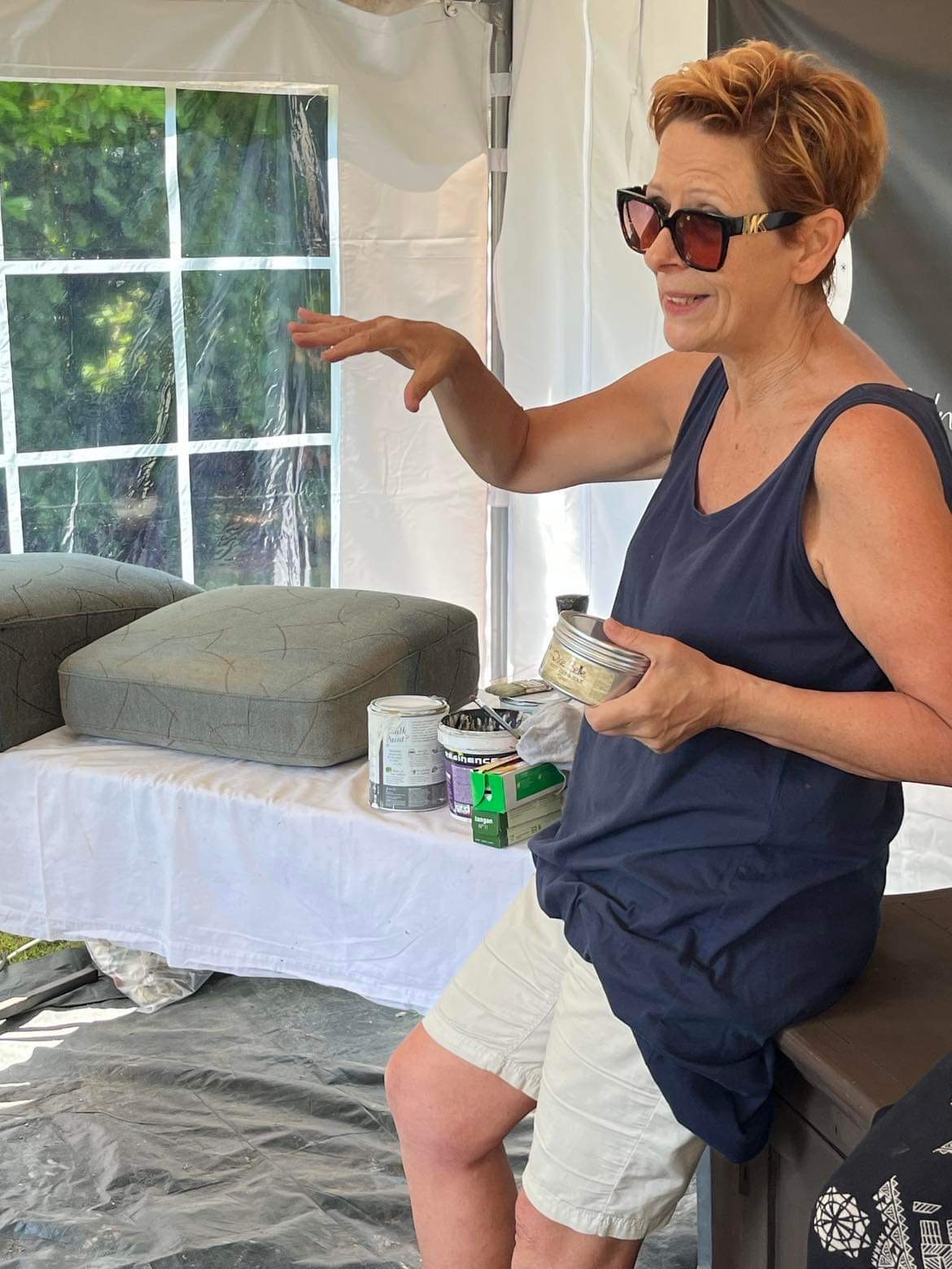
Can you paint fabric on chairs? Will it hold up? What method to use? How to do?
In this post I’ll talk about 3 techniques of how I paint my fabric chairs… I paint my fabric chairs, yes I do 🤗
I’ve been a little addictive to transforming chairs lately. From old wooden school chairs to beautiful armchairs, I just love restyling them, giving them a quirky and unique outfit.
Most of the times I also use decoupage paper to embellish them.
Here’s a few examples of painted chairs – fabric, leather, faux leather finish, vinyl
I work mainly with 2 different techniques and just added a third one to my bow. Thank you to my fellow colleague @Tracey’s Fancy. I’d like to walk you through these 3 different techniques. For you to choose which one you prefer because in the end they are all holding up well.
“DYEING” the fabric with watered down paint
This is the one I started off with and used it until not long ago. It’s quite a long process but I guess it’s the one us creatives use most of the times. Paint hardens so the finish has a leathery feel to the fabric. It’s not hard as rock but not as soft as before painting. Just so you know 😉 I’d say this is the most time consuming method and the fabric is not as soft as with the others. Still keep in mind that paint will “harden” your fabric more or less whatever method you use. Some people use fabric softener mixed with the paint. I haven’t done it yet.
What you need: a watermister, paint brush, watered down paint of your choice (I use both chalk paint and chalk mineral paint), sanding paper 250 and 400. Stencils and or decoupage/rice paper if wanted, wax or top coat.
Vaccum your fabric to get rid of all the dust and dirt
Wash the fabric with warm soapy water let dry
Clean wooden structure, give a light sanding to give the paint tooth if you are going to paint it.
Choose your color and water it down app. 40 paint to 60 water for the first 2 coats, then 50/50 water and paint. Stir every now and then because the good stuff settles at the bottom quickly.
Mist your fabric all over. Make sure it’s wet so paint can adhere. Then apply your first coat. Let dry completely.
Sand lightly, wipe clean.
Repeat the process until you’re happy with the coverage. This can take a few layers
Last time light sanding with 400 grid paper
Create depth, shadows and highlights by layering your colors if wanted.
Now apply any embellishments you want.
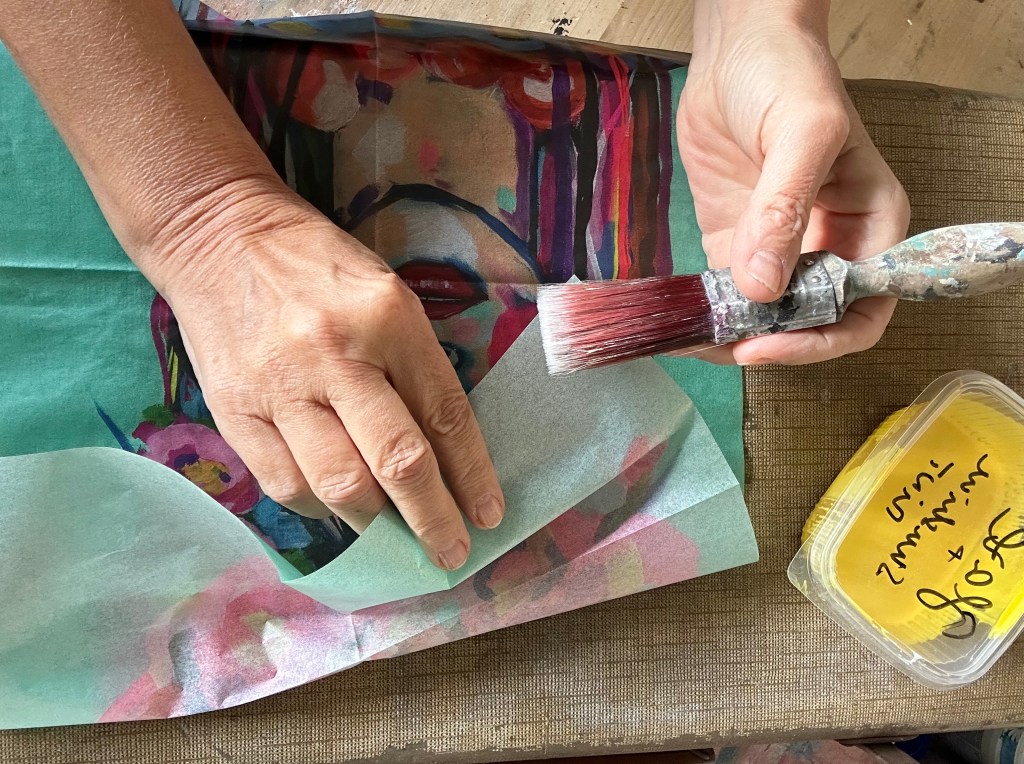
Stenciling for example can be a good choice. I also like to apply decoupage paper, specifically on the front or back which can be less prone to problems opposed to on the seating.
I have applied paper on the seating several times and my clients say it’s holding up fine. But if you’re worried then just apply the paper on the front or back backing. And you can of course also hand paint a design. I’m not good for that but might give it a try one day LOL
Apply topcoat for protection. I use water based top coat or wax. Brush on 2 very light coats of topcoat (let dry in between). Or use clear wax. Brush on, let it sit a few minutes and wipe off the excess. You can apply a second coat.
You can now paint the frame of your chair – I usually paint it after I finished the chair. But that’s a preference thing.
I paint it a solid color or do a wash.
Sometimes I just leave the wood as is but give it a coat of darker wax to nourish and embellish.
If painted you might need/want to protect the finish with a top coat or wax
There are many tutorials for the decoupage part. I also have a few on my YouTube channel if you’d like to check https://bit.ly/3nmiXPg
Here’s a short video that shows the first steps
USING WAX between layers
This technique caught my attention not long ago and I definitely love using it. It’s so efficient… Finish: Fabric stays very pliable, it’s softer to the touch than with the “dyeing method”. The wax helps to achieve that. Just don’t put thick layers of wax.
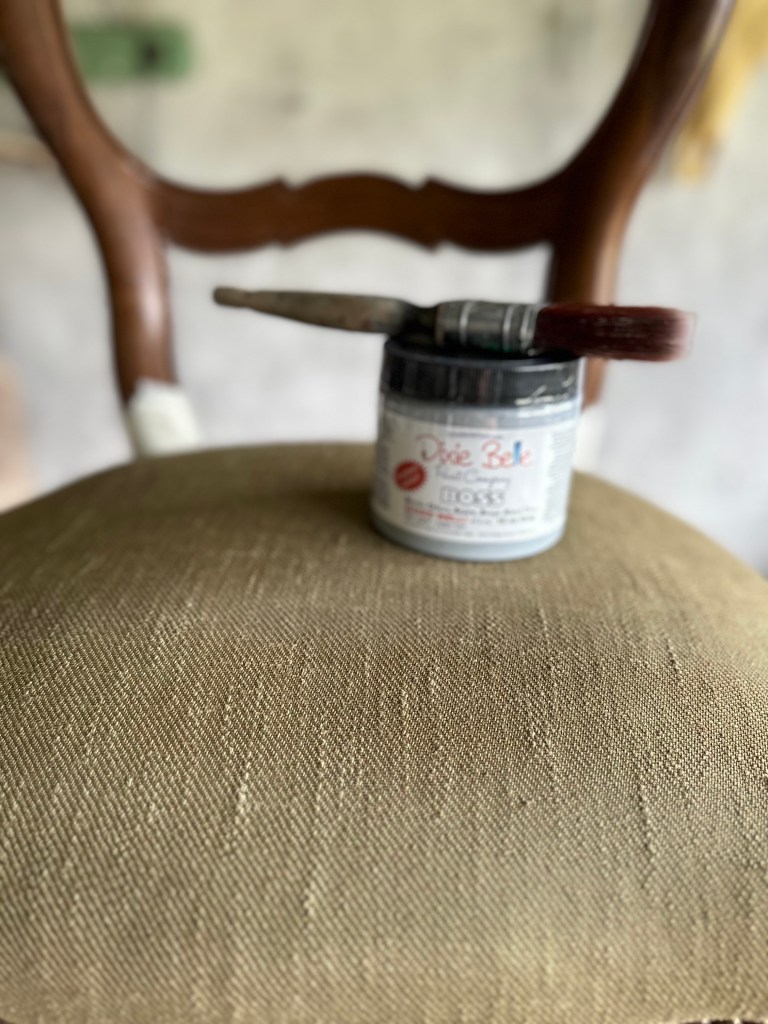
What you need: waterbased clear wax (this is VERY important. It will not work with oil based wax!) I use the clear wax from Dixie Belle Paint and color of your choice (I use both chalk paint and chalk mineral paint), sanding paper 400 grid, stencils, decoupage/rice paper, wax or/and top coat, water mister
Prep and cleaning as previously. Let dry
Take your water based clear wax and rub the wax into the fabric (use a paintbrush – a chip brush is just fine).
Make sure there is enough wax all over the area but don’t overdo it. Once done it will have a humid/cold feel to the touch.
Right after applying the wax apply your first coat of paint. Work in thinner layers not to add build up on the fabric.
You can use a light mist of water so your paint brushes on easily…but don’t use so much water that your paint sinks into the cushion.
You can also mist your paint brush now and again, that also helps.
Let the paint layer dry! Don’t use a heat gun to speed it up as this will soften the wax underneath and you’ll have adherence problems afterwards.
Give a very light sanding with the 400 grid paper – it really softens the fabric. Keep a very light hand because you don’t want to get down and activate the wax by using pressure.
Building layers: Second round of applying wax like before and then applying paint. Have a light hand with the paint layers!
You definitely need less layers and drying time than with the “dyeing fabric” method. I found that 2-3 layers of paint are enough to cover the initial fabric. If you have flat fabric like cotton for example your coverage is easier then having a textured fabric.
The coverage also depends on the pigmentation of the paint brand you use.
As above apply your embellishments once you’re happy with the coverage. You can always add some paint to blend or for your special design.
Let dry everything
Then use a top coat or wax. The good thing about water based wax? You can apply the wax and on top of it you can use a top coat. Which is not possible the other way round.
Paint your frame or leave wood. Protect the finish with a top coat or wax.
Tip: I always decoupage before I paint “creatively”. The image then guides me to the colors to use for the rest of the chair and the final finish.
One important thing: if you apply decoupage then it’s best to have a light coat of paint (white) underneath the paper. That way is pops. If you have a darker color underneath your decoupage paper will blend in and it will be less crisp.
I did a tutorial on my You tube channel on this specific method. You can check it out here: https://bit.ly/3nmiXPg
And these are a few pieces I did with this technique:
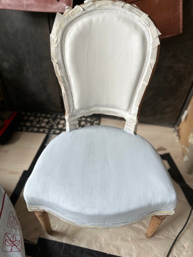
“USE PRIMER to create barrier”
This is a similar technique to the previous one. But instead of applying wax I’m using a primer. (I use Boss from Dixie Belle but I’m sure there are other brands)
Apply one or two coats of primer. My fellow creative colleague from Tracey’s Fancy uses this one on her whimsical creations. In my opinion this is a great method when you hand paint a design on your fabric upholstery. It’s also quite efficient 😉 The finish is not as soft as with wax though.
What you need: BOSS primer (white or grey), Paint and color of your choice (I use both chalk paint and chalk mineral paint), sanding paper 400 grid, stencils, decoupage/rice paper, wax or/and top coat, water mister.
Prep and cleaning as previously
Paint one or two coats of BOSS over fabric. Depending on the fabric texture and color. Let dry between layers.
Sand very lightly with 400 grid paper. It gives a nice smooth touch.
Paint the fabric of the chair with the color(s) of your choice. Work in thin! layers
Sand lightly in between, wipe clean.
Then feel free to create YOUR UNIQUE design using embellishments you like. See previous section. And why not hand paint something?
Again work in thin layers not to add build up on the fabric.
Protect your work with top coat or wax
Paint your frame or leave the wood.
Protect with top coat
After cleaning, just paint the primer over the fabric
after adding primer
Personally I love the wax method best 🤗😊
There are a few things to consider before starting to paint though.
First focus on what type of chairs are best to look for when considering them for this type of transformation – I always try them out, sit on them to see if they are comfortable. Andthen how toactually apply the paint and what my vision is ( this can change though 😂) Shall it be quirky, romantic, leather look, industrial style, whimsical…. So many possibilities. Use it as your canvas and just have fun!
Important
Best fabric to paint is a tight woven, flat one like cotton. You can also paint vinyl (I’d use a primer like Ultra Grip from Fusion or Slick Stick from Dixie Belle first though), faux leather, leather, linen, satin, denim, polyester…
Here I painted a faux leather armchair. One of my first (nearly) painted chairs
It was a bit too boring before.
Prep and paint away.
I love creating old, worn leather looks. No decoupage here but some stenciling to enhance it all.
One thing I stay definitely away from is velvet or velvet like fabric, tweed and chenille. I’ve had terrible experience with these. And lately I’ve ruined a beautiful armchair – see below. I knew I shouldn’t paint that kind of fabric and still went for it. Well NEVER AGAIN…, I will listen to myself LOL
As a general rule…
…it’s best to paint on chairs that have firm cushions/seatings and that the upholstery is tight. When you find THE chair check following: make sure there are no tears and also have a look underneath that nothing is “unrepairable”. I’ve had my pair of surprises (torn fabric, loose wood, different heights of legs…) but because I liked them so much I forgot to check or just played blind 😬. Meaning more work. Much more work!
Avoid heavy textured designs. Sometimes I like the chair and still go for it. If you look at Leonardo le Beau you can make out quite a bit of the initial design but I think it’s just fine.
I hope I inspired you to give this a try! Surely you’ve got an unloved chair somewhere in your home, …. or you know someone who does….or found one at a flea market/charity shop that you’ve been wanting to transform…!
I also offer workshops where I teach you how to create your own unique chair in person. Feel free to get in touch. And there will soon be a step by step tutorial here on my website. Stay tuned.
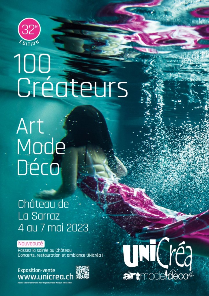
Connaissez-vous le salon UniCréa ? Non ? Je vous le conseille vivement. Rendez-vous la prochaine fois qu’il aura lieu au château de Coppet/VD début octobre…
4 jours immergé dans cet univers qui est UniCréa. 100 artistes ART MODE DECO sélectionnés pour cette occasion qui exposent leurs merveilles.
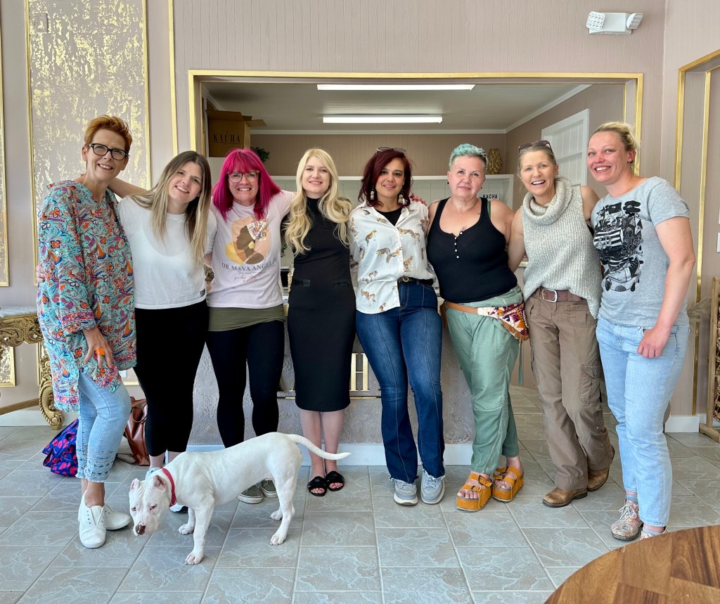
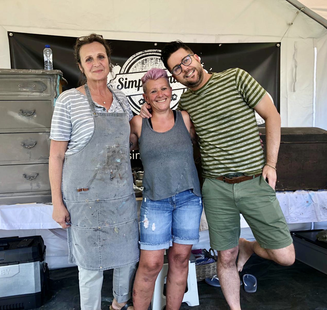
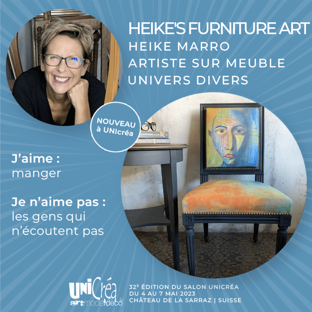
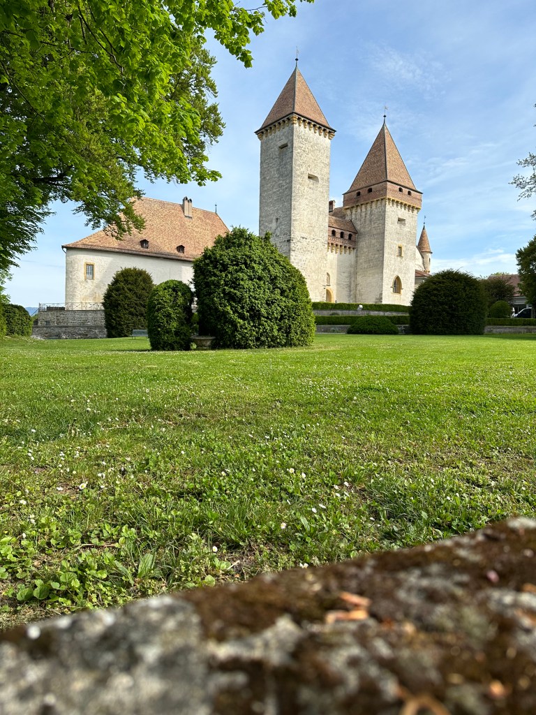
Le weekend du 4 au 7 mai 2023 j’ai eu l’opportunité d’exposer au salon d’artistes de UniCréa dans un lieu tout simplement magique… le château de la Sarraz/VD.
Une expérience tellement riche en rencontres et échanges que ce soit avec les visiteurs, les organisateurs ou encore les collègues artistes.
Comme pour toute expo il y a beaucoup de travail. Ca commence toujours avec la création et la préparation de mes pièces, de l’installation sur les lieux, 4 jours d’exposition et se termine par la désinstallation et les au revoir. C’est sûr que j’étais fatiguée mais quand on me demande si je le referai, ma réponse est 3x oui.
Je tiens à remercier Céline Dréveton la responsable qui a su motiver ses troupes dans toute circonstance et tous ceux qui ont aidé à ce que cette édition soit un grand succès. Des rires, de la gentillesse à profusion, des discussions – J’en sort inspirée, motivée et heureuse.
J’y ai découvert des créations uniques, insolites et tout simplement beau.
Elle n’est pas adorable cette vache peinte sur palette en bois? Artiste: Cécile DAURIAC-VUIBERT
Un photographe a pris ces photos de deux (ou plutôt 3) de mes créations… 2 chaises relookées avec un design unique et une sacoche vintage.
…et une de mes créations dans son nouvel espace – un fauteuil ancien relooké, dans une galerie
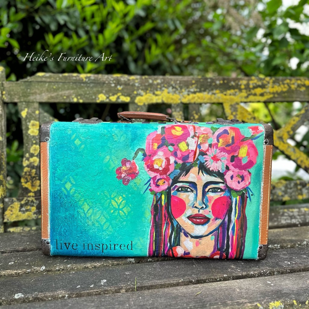
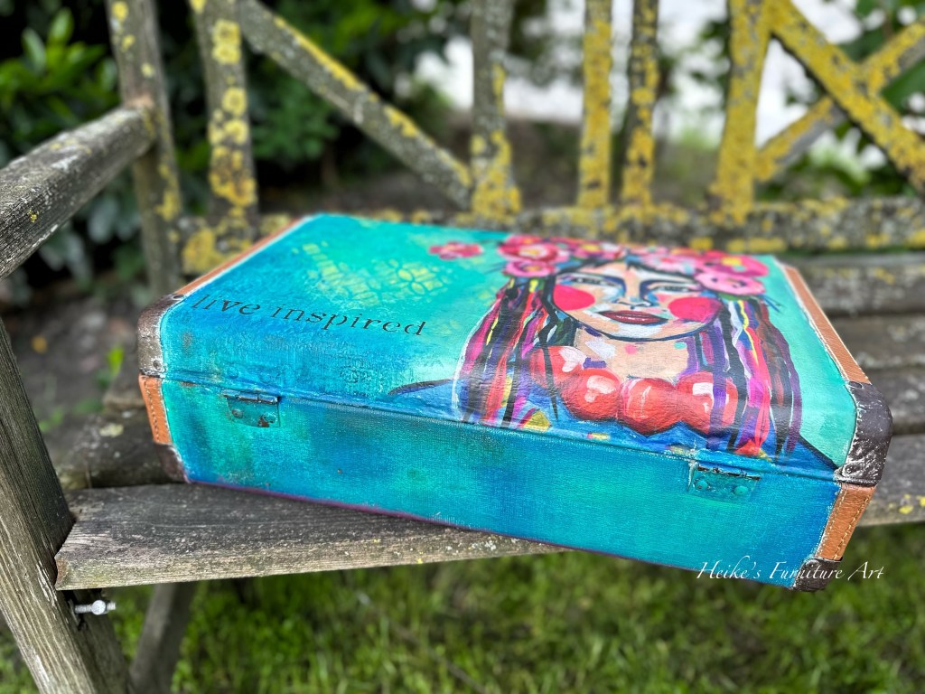
L’organisation m’a demandé de faire une petite démo pour montrer comment je créé mes pièces. Une valise ancienne relookée est née sous un meilleur jour et elle a de plus tout de suite trouvé un amoureux.
Résultat final de la valise
Si vous l’avez manqué, pourquoi ne pas venir à la prochaine édition du salon UniCréa? Cette fois le salon aura lieu au château de Coppet du 5 au 8 octobre 2023. Vous n’allez pas le regretter.
Au plaisir de vous y rencontrer, je vous dit à bientôt
Heike
English textonly
Do you know the UniCréa fair? No ? Then I strongly advise you to go there the next time it takes place.
4 days immersed in this universe that is UniCréa. 100 artists ART MODE DECO selected for this occasion.
Last weekend from may 4th to 7th 2023 I had the opportunity to exhibit at the UniCréa artist fair. In a simply magical place which is the castle of La Sarraz/VD.
An experience so rich in contacts and interactions with visitors, organizers and fellow artists.
As with any exhibition there is a lot of work involved. It starts with the creation and preparation of my pieces, the installation on site, 4 days of exhibition and the de-installation. It’s true that I was tired but when asked if I would do it again my answer is 3 times yes.
I would like to thank Céline Dréveton, the person in charge, who knew how to motivate her troops in all circumstances and all those who helped make this edition a great success. Laughter, kindness, discussions – I came home inspired, motivated and happy.
I discovered unique, unusual and simply beautiful creations from fellow artists.
The organization asked me to do a short demo to show how I create my pieces. A redesigned vintage suitcase was born and it immediately found a lover.
If you missed it this time, why not come to the next edition of the Unicréa art fair which this time will take place at the Château de Coppet from October 5th to 8th 2023. You won’t regret it.
Habt ihr schon immer mal nach DEM Handbuch für Möbel-Upcycling gesucht? Die Suche ist definitiv vorbei!
Wir haben alle das eine oder andere Stück in unserem Haus, Keller, Dachboden, welches ein Makeover brauchen könnte. Der Trend ist upcycling, nicht wegwerfen. Aber wie? Hier ist die Anleitung dazu.
Ein « Muss » für alle Kreativen und alle die gern DIY machen
Die tolle Künstlerin und meine liebe Kollegin Daggi @Gonepaintin hat soeben ihr Buch “Das Grosse Möbel-Makeover” heraus gebracht.
Was soll ich sagen?
Wunderschöne Darstellungen
Tolle Bilder – ich konnte mich gar nicht satt sehen
Inspiration à go go
Viele verschiedene Techniken
Theorie und Praxis super vereint
Daggi’s Grosses Know How macht’s einfach(er) sich trauen einfach mal den Pinsel in die Hand zu nehmen und anfangen
Detaillierte und klare Informationen von Anfang bis zum Ende eines solchen Makeovers
So viele brauchbare Tipps und Tricks
16 Schritt für Schritt Projekte zum Nachmachen – alle unterschiedlich aufbereitet. Von Rostoptik zu Shabby Chic…, von Decoupage zu Schablone… Alles da!
Es lohnt sich wirklich!
Unten seht ihr ein paar Ausschnitte aus ihrem Buch ” Das Grosse Möbel-Makeover”
Eins von den besten Büchern in der Art, welches ich bis dato in der Hand hatte. Sogar ich konnte noch ein paar Dinge mitnehmen. Und was mir noch besonders gut gefallen hat ist, dass Daggi nicht nur eine Marke vertritt sondern verschiedene präsentiert und über die Eigenschaften erzählt. Somit kann jeder für sich nehmen, was er/sie braucht.
Schaut doch mal auf ihrer Webseite vorbei: https://www.gonepaintin.de/ Dort könnt ihr es auch gleich bestellen.
English version text only…
Have you ever been looking for THE furniture upcycling guide? The search is definitely over! And if you speak German, then this is for you.
We all have a piece or two in our home, basement, attic that could use a makeover. The trend is upcycling, not throwing away. But how? Here’s how to do it.
This book is a ” must ” for all creative people and all those who like to do DIY
What can I say?
Beautiful illustrations
Great pictures – I could not get enough of them
Inspiration à go go
Many different techniques
Theory and practice super combined
Daggi’s great know how makes it easy to dare to take the brush in hand and start
Detailed and clear information from the beginning to the end of such a makeover
So many useful tips and tricks
16 step by step projects to copy – all differently prepared. From rust look to shabby chic…, from decoupage to stencil… It’s all there!
It is really worth it!
One of the best books in the kind, which I had in hand so far. Even I could still take a few things. And what I particularly like is that Daggi does not only represent one brand but presents different ones.
Let’s have a look at a few points, tips and tricks
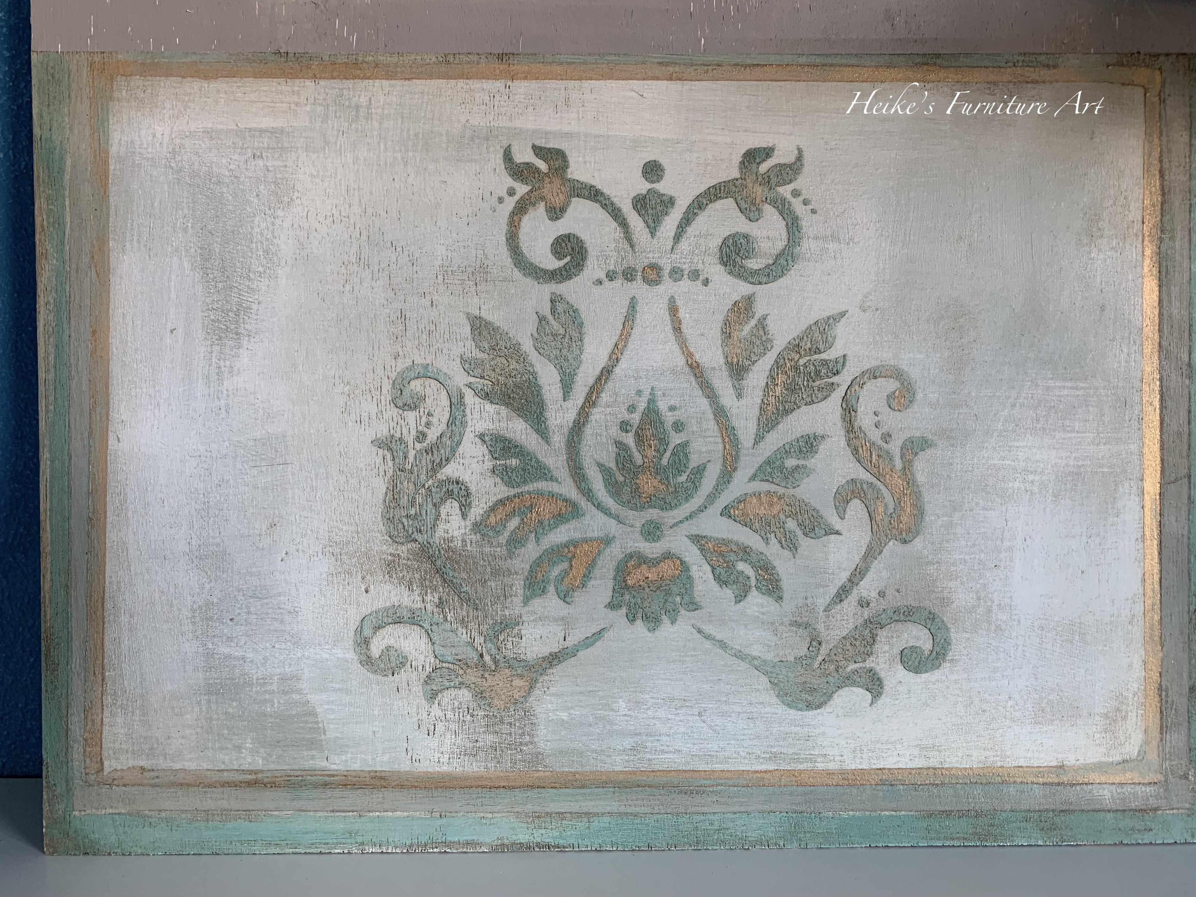
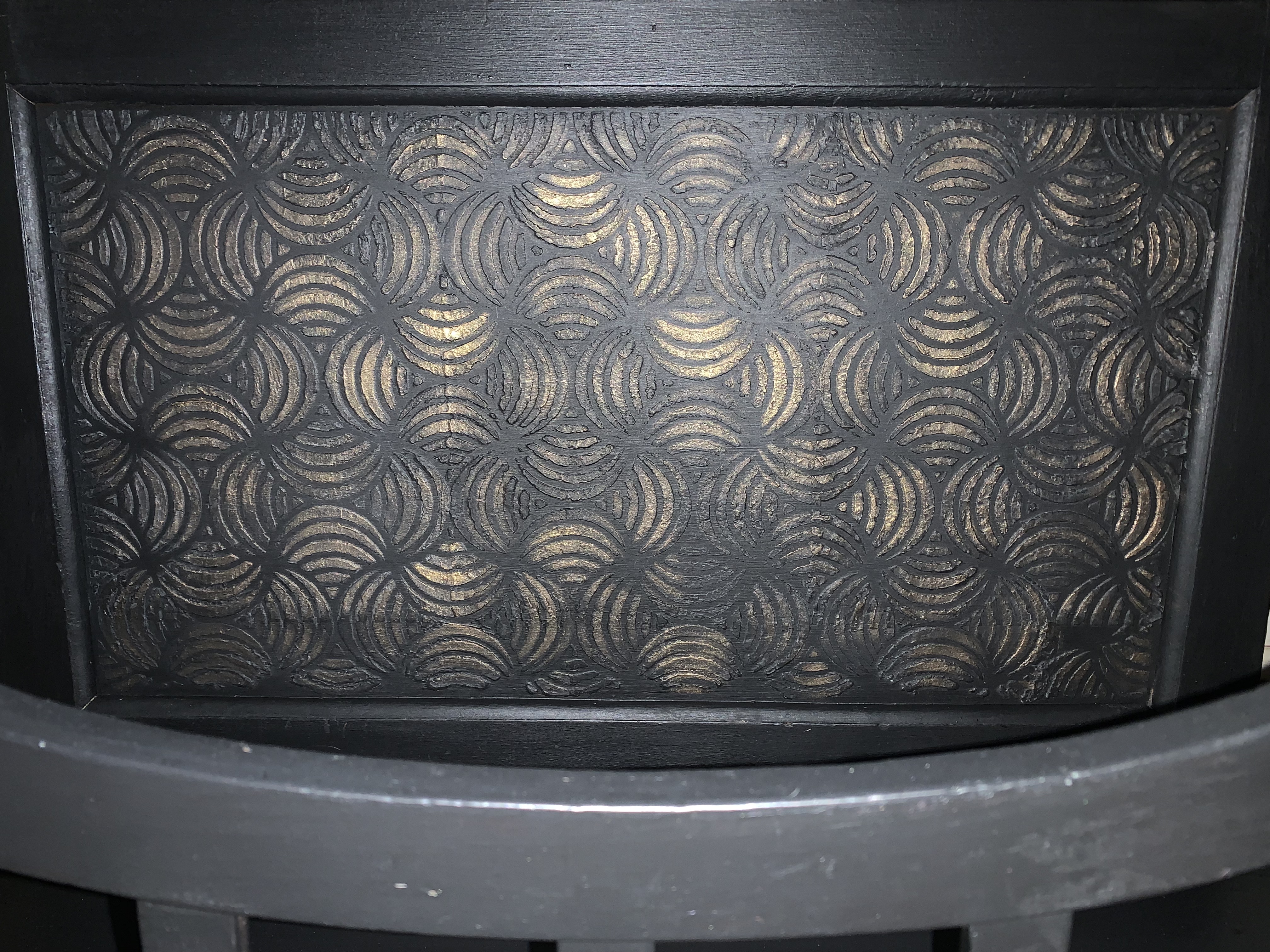
Do you love stenciling as much as I do?
I love using stencils for their versatility, be it so called normal stenciling or raised stenciling. I think that sometimes they just make THAT difference on a piece. I own a ton and when I say a ton I mean a ton. I bought myself 2 big art folders with presentation clear sleeves in different sizes.
They aren’t cheap but oh how practical. Each section/sleeve has a name such as “BOHO”; “BACKGROUNDS”; “SWIRLS”; “MANDALA” etc. Flip through them to find THE one or more of course you want for your piece. So time saving I can tell you LOL
Don’t worry, stenciling is not that complicated and you really can get superb results on your pieces. The challenge people (and tbh I put myself with them) encounter mostly when applying paint through a stencil
The paint is seeping behind the stencil – it’s also called bleed through and this can cause a blotchy print or the edges are not clean or crisp. Very frustrating and discouraging.
Here are a few things to keep in mind for the so called normal stenciling
Use good quality stencil with higher Mylar, This is especially important for the raised stenciling.
I generally use a paint brush with firm bristles not necessarily a stencil brush but they work absolutely fine too.
There must be no gaps between your stencil and the surface! Use masking tape AND hold it down. Another great way is to spray repositionable contact adhesive especially if used on walls for example. I have these huge stencils and honestly they are difficult to hold in place just with some tape.
Do NOT put too much paint on your brush. It’s better to have a brush “under loaded” than the contrary. Pour a little paint on a dish, dab your brush in the paint, then dab it next to the paint pour to even it out. Next dab off the paint on a piece of kitchen towel. You’re ready to go now: Make a stippling movement on your stencil working from the edges inwards towards the stencil holes. Do this all over the stencil design and load/offload paint while you complete the design.
Don’t forget to clean your stencil with warm soapy water and take off the paint. If you used the adhesive spray then some mineral spirit before washing will do the trick
The one on the right is normal one colored stenciling and the blue piece stenciling was achieved by using different colors
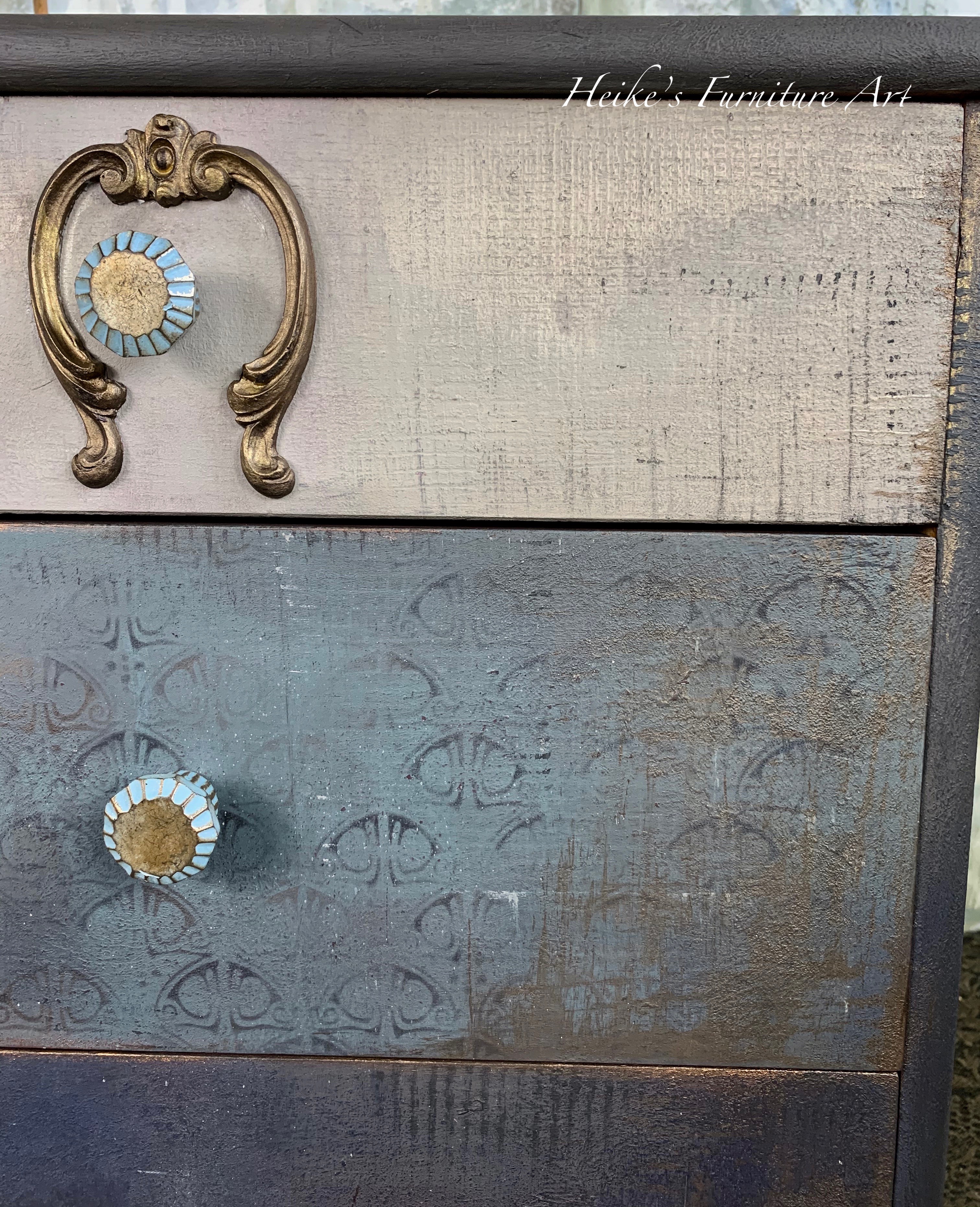
Use as subtle background
I also like using the stenciling as a faint background design. When I place my stencil I will not go over every single area, be very light with my paint or with my gilding wax that I like to use to create the design.
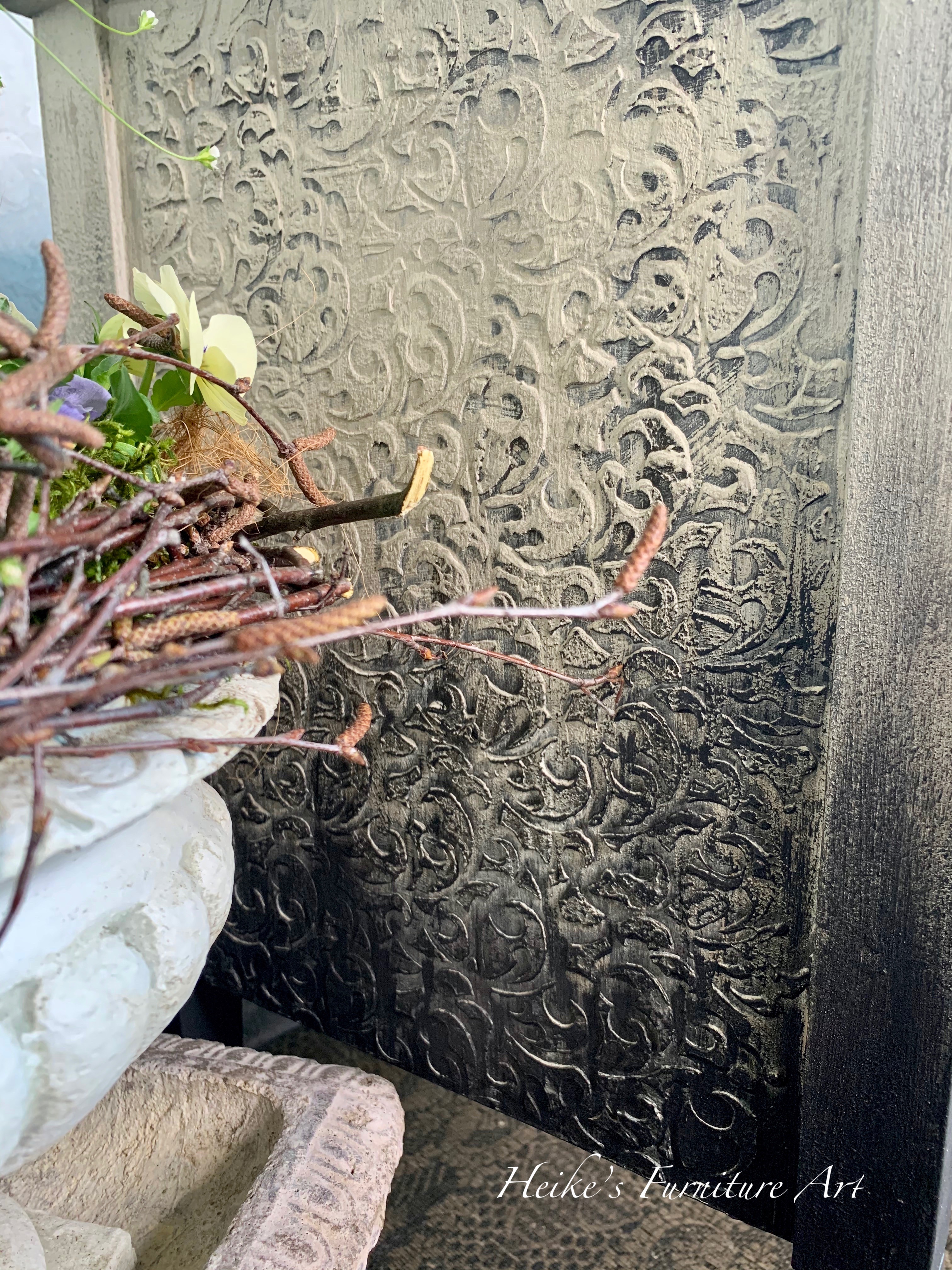
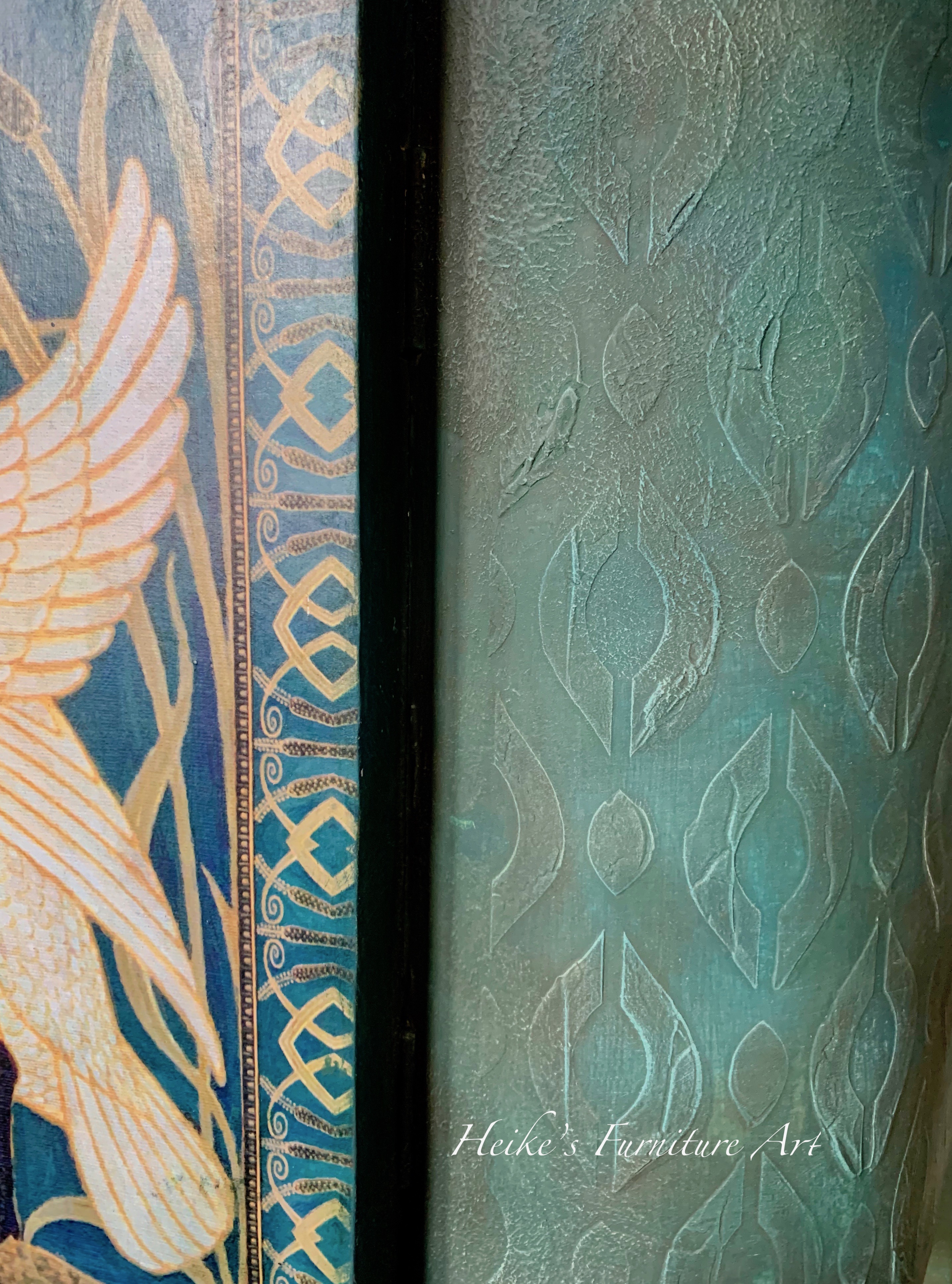
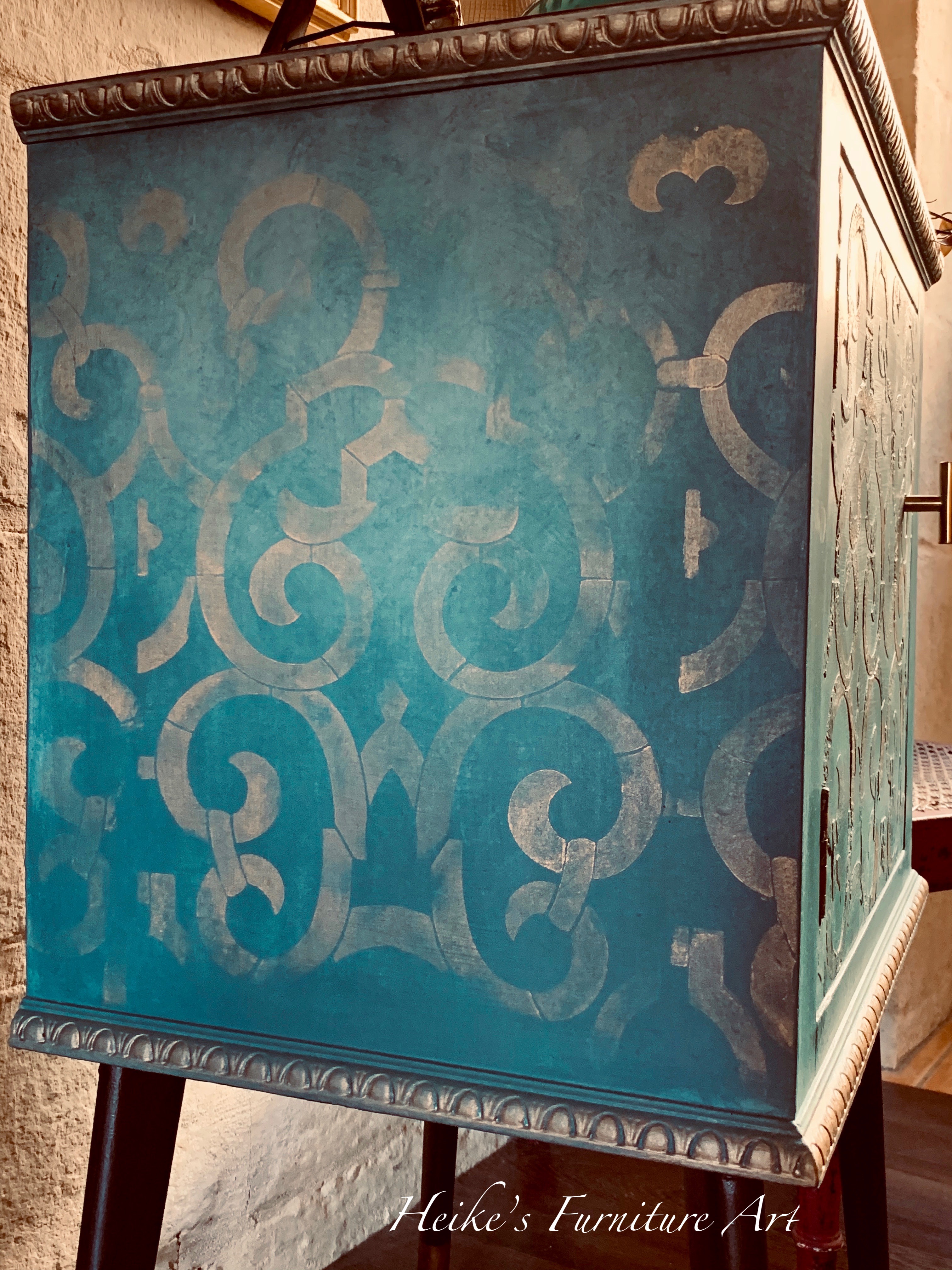
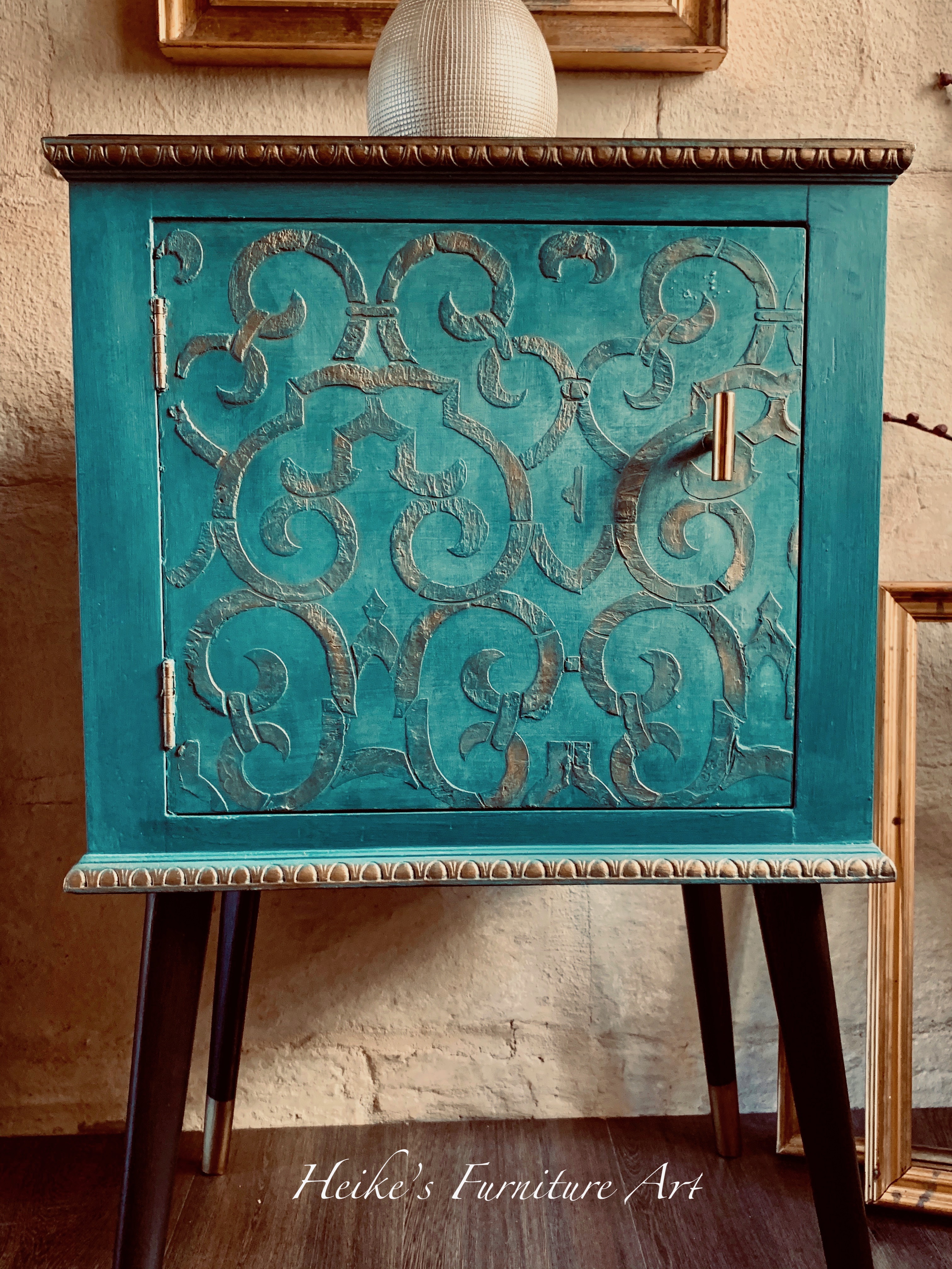
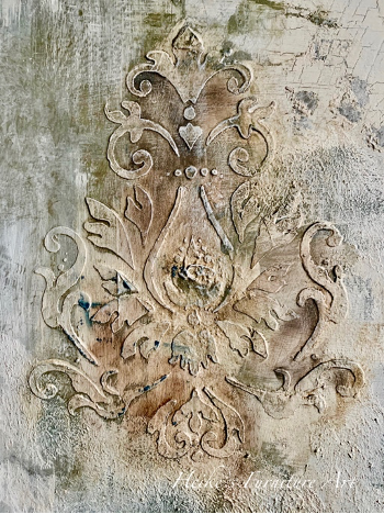
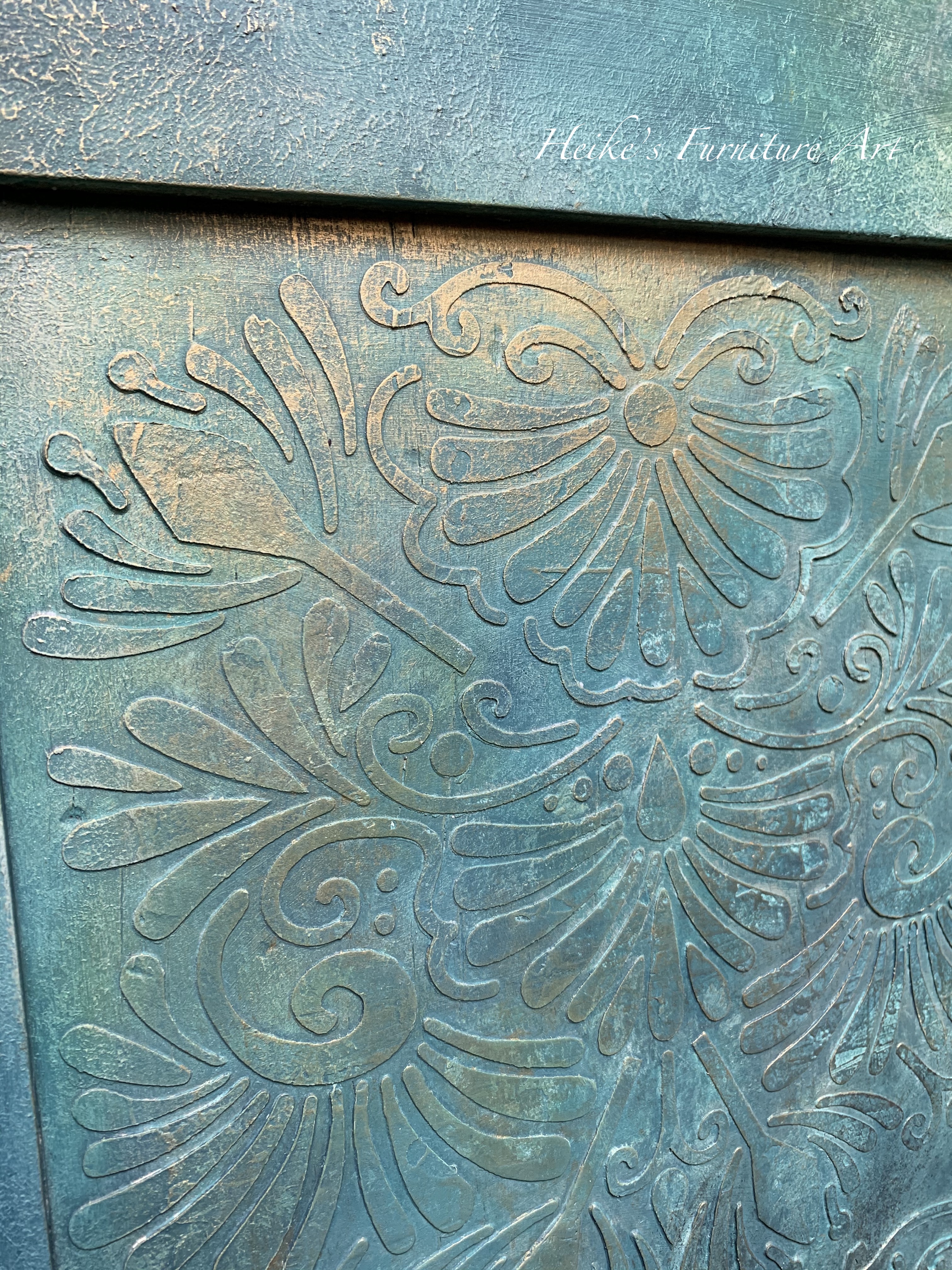
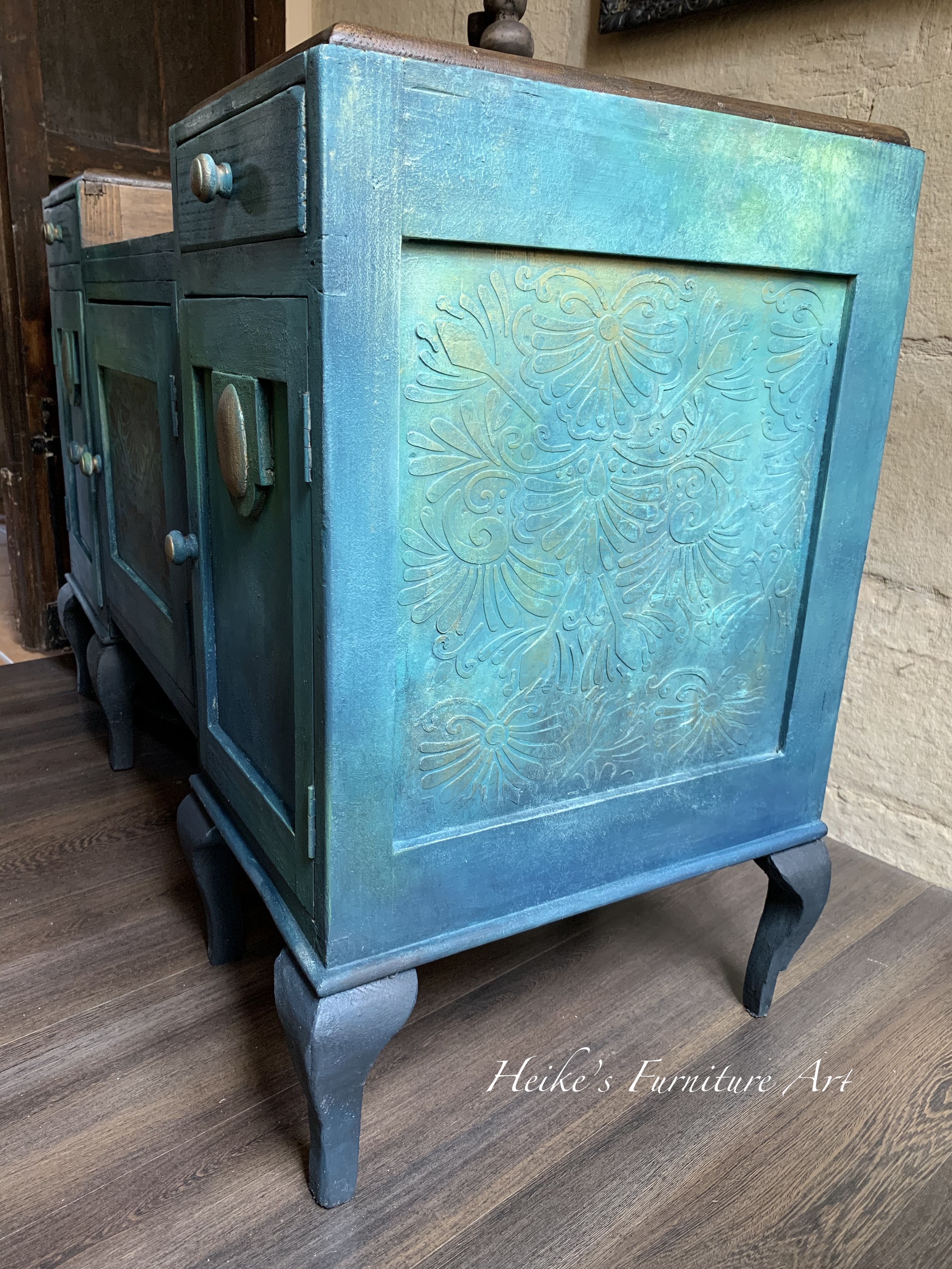
Raised stenciling is my absolute favorite
For the raised stenciling you may use different mediums such as joint compound or paint with a texture additive medium. I like using both, depending what I have on hand at the moment. Paint, waxes, powders…. catch in the nooks and crannies achieved with the stencil. Love it!
The challenge is the same as above – seep through the design.
Advice: Tape the stencil to the surface to prevent shifting.
Smooth a layer of texture over your stencil, using a spreader. This can be an old credit card or a silicon spatula or a plastic spreader. I like the Dixie Belle mud spatula or a silicon spatula best.
Tip: if you like it structured and not smooth then once you applied the medium with your tool, dab lightly over the medium to create some kind of roughness.
Apply firm but even pressure. If you have a splodge once you take the stencil off, scrape it away while the medium is still damp, using a tool with a flat edge or an ear cotton bud.
Several layers of medium create a heavy raised stencil. You can also add some very fine sand medium for example to achieve this look. Here I used a thick but workable mixture of paint and Sea spray (a Dixie Belle texture additive) let it dry and then layed my stencil over the existing dry design and added another mixture. This time adding a bit of sand medium.
Tip: if you just blow dry a minute so the top has a kind of a “skin”, it’s easier to take the stencil off for the first time.
Here’s another example of a high raised stencil I have done a while back. I think I did about 3 or 4 layers with joint compound. Make sure you let each layer dry and clean your stencil immediately after use, let dry before using it again. Give the design a quick light sanding to take off the peaks that might have been created and smooth it. Don’t overdo it because you’ll thinnen the stencil design. The funny thing is whenever someone comes and sees this particular piece they touch the stencil. It’s so detailed and visible, people usually think it’s a mould.
You can then paint everything and play with waxes to make the stencil pop.
ADVICE: For every raised stencil design
Let dry completely. Sand back any highpoints/ peaks and smooth out with a 220 grid sanding paper. You can now paint your piece and let it dry. Apply darker waxes or gilding waxes or paint to enhance the raised stencil.
Difference of gilding waxes on a raised stencil.
Sometimes no colored wax or creative powder is needed to enhance the finish if you play with paint color layers on top of the stencil like below
Examples of some of my stenciling
Whether or not you would prefer to use raised or normal or 3D stenciling on your piece is a personal choice. Just remember to have fun end enjoy.
So, to reply to the question in the title “stencil or not to stencil?” Don’t be afraid, just have fun and enjoy.
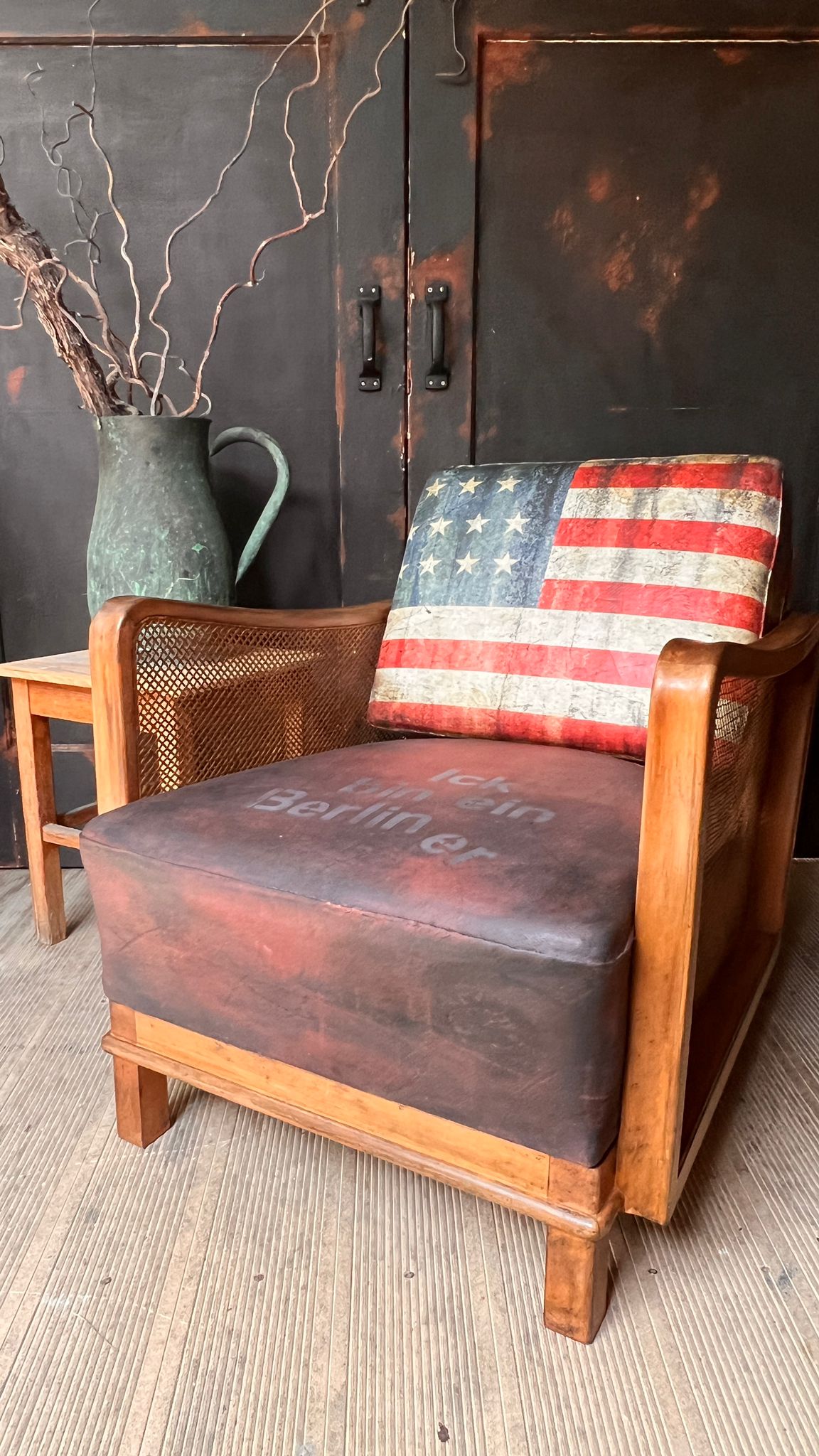
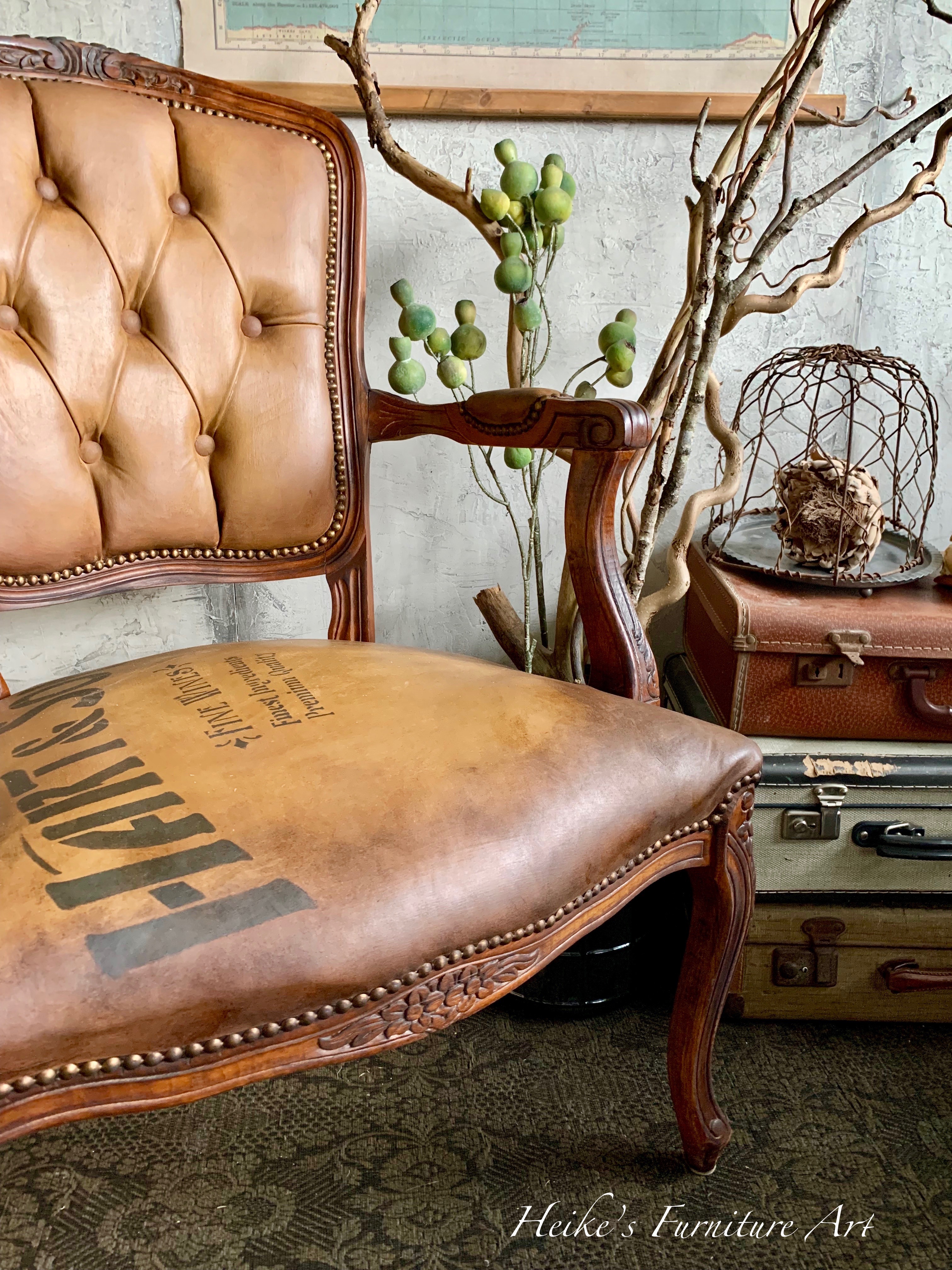
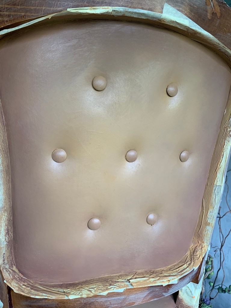
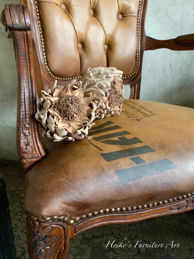
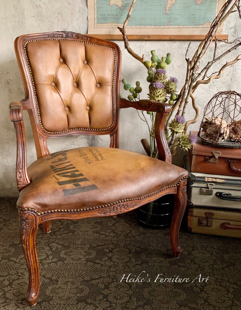
This piece has been sitting and waiting for me to find some time to transform it. I had known from the beginning that I wanted the “old leather industrial look”. I could envision an armchair that had been used for many many years in a gentleman’s club where they smoke their cigars whilst meeting and chatting. Our interior is on the industrial side so what better finish. I was inspired by a similar finish that my friend Jonathon Marc Mendes did. He’s an amazing artist.
The chair wasn’t fabric as you can see. Just plain ugly artificial leather look but to be honest in quite good condition. Easy painting for this one. You have to know that it’s really easy to paint a fabric chair with chalk paint. Just use cotton or any flat finish. And best avoid heavy or velvet fabric.
So, let’s do this.
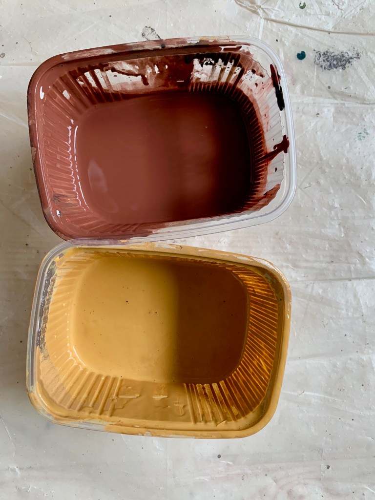
I used following Dixie Belle products
White lightning for cleaning
Colonel mustard
Terracotta
Florida Orange
Chocolate
Coffee Bean
Rustic Red
Clear wax
A mix of brown and black wax – I wanted a very dark brown for the look
First thing to do is to thoroughly clean the piece. White lightning is my go to product. Protect the areas you don’t want painted. I also covered the studs because I didn’t feel like cleaning them from paint afterwards.Always looking for the easy way.
Normally you would mist your fabric thoroughly and let it soak into it, but I didn’t need to here because of the existing finish. Just a bit and to help the paint glide better. Mix your colors together to achieve kind of a soft muted orange/cognac base with brown undertones. I used Terracotta, Colonel Mustard, Chocolate and Florida Orange.
Water down the mix so it gets a little runny (I’m always eyeballing but I would say 60% paint and 40% water for this piece). This also helps creating thin layers. I then did a first base and let it dry.
I started building up my layers and used a sanding pad between each coat to remove and smooth any bumps and brush strokes on the piece. (I used 400 grid paper) I repeated this process 3 times. You might need more layers depending on the design of the fabric you have. Here is what it looks like at this stage.
Very important: do thin layers and keep building them up one by one!
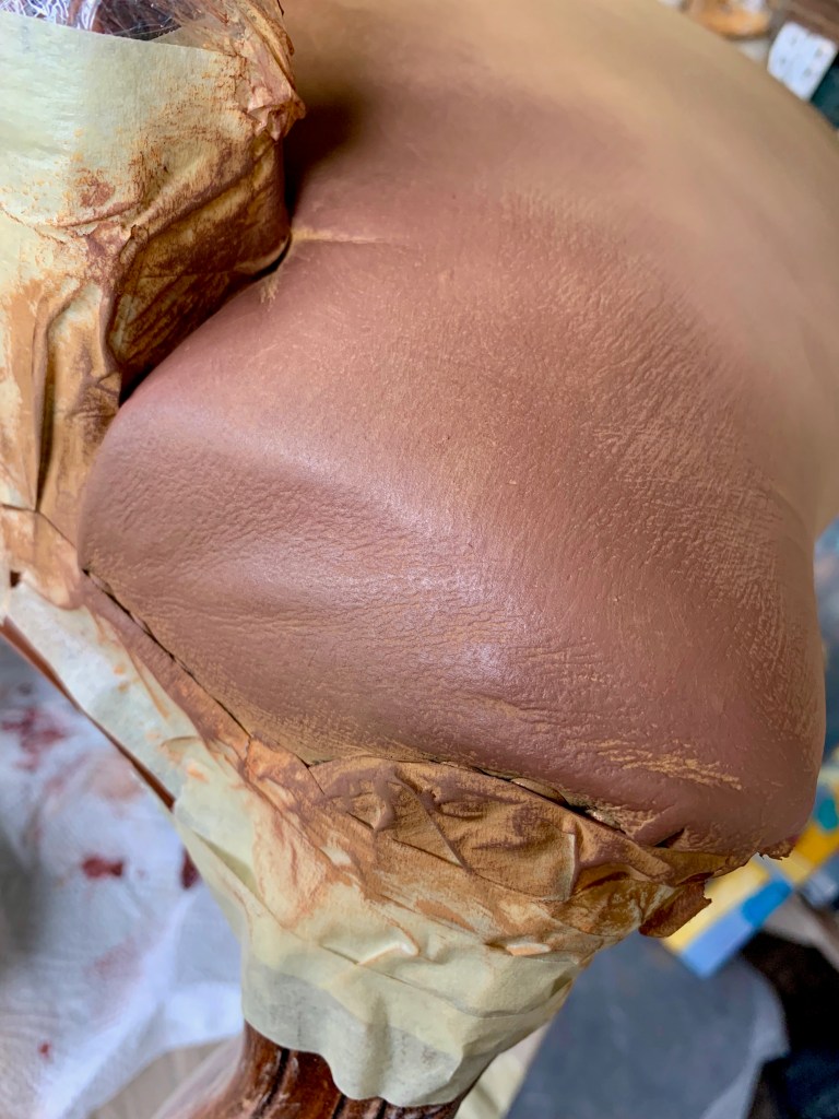
I mixed some rustic red with a bit of dark brown (here it’s Coffee bean) to tone it down. Then I started applying this color in corners with a blending technique towards the middle using my base color and the rustic red mix. Mist a little if you feel the paint is dragging or not blending well. Here’s what it looks like.
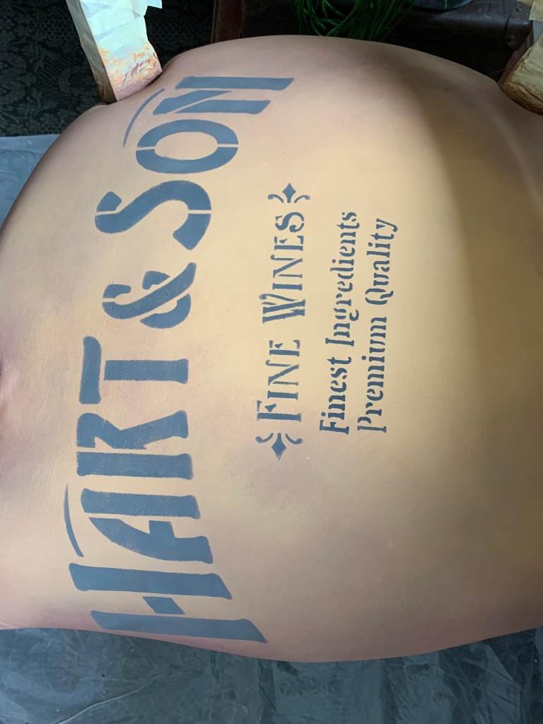
I knew I wanted some stenciling to go with the style I envisioned. Here are the ones I used on the chair. I decided to use some dark grey paint to apply them. I think that black would have been too stark on the piece.
It’s waxing time after your piece is thoroughly dry. I just love using wax. See the before and after once waxes have been applied. This is when that old leather look comes to life. Isn’t it just a fantastic difference?
I applied clear wax all over first. You don’t have to and can go directly with the dark wax but if I go too heavy with the dark wax and want to remove it’s so much easier. Clear wax acts like an eraser.
I took off excess and then used a first all over coat with dark wax then took off excess again. After that to enhance and create darker edges and parts on the piece I applied the dark wax heavily in certain areas. I didn’t wipe this layer off. It really is about creating character and the authentic look. I let the waxed piece “harden” for several days and then buffed everything. Check it out here
Here is the finished and staged piece. I love it and it will go perfectly with our interior.
I hope you’re inspired to create something similar. Have fun!
And if you have any questions then do get in touch.
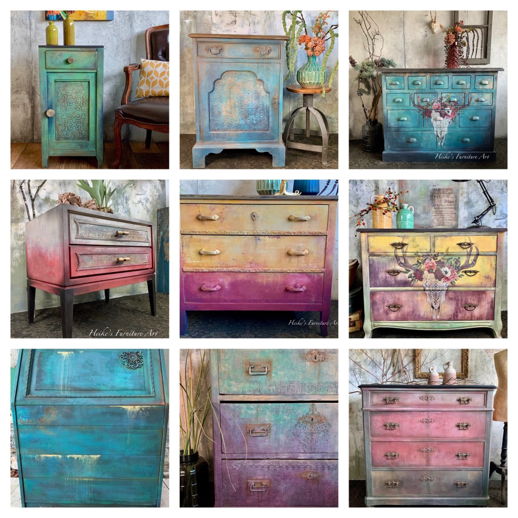
I have always loved color. On my hair (yep, it has changed several times throughout the many years), my clothes, in our house and today in my furniture painting.
I remember when we built our house I wanted colorful walls but the painters looked at me with big eyes and said: “we only paint white – color doesn’t look good on walls”… Come again? I don’t know what kind of painter this was but I wasn’t going to let my idea of colorful walls go. I painted them myself – that was 25 years ago. At that time my color choices (each room a different color) might not have been the best. I think that “less would have been more “.
Colors have changed in the house throughout the years. Today I mostly went back to more neutral walls but having a few splashes of color either with my furniture, for my decor or on part of the walls.
My love for color is definitely reflected in my painted furniture that I do. And although it’s more of an intuitive painting for me, I sometimes have a look at the color wheel and see what might work better or best with a color I chose. Which is the complementary color of green or blue or red? It helps. It’s definitely worth to get one if you want to use color in your life. That being said, I do what feels right and feels good and create my own shades of said complementary color.
One thing I’m sure of is that color really can effect us emotionally. Put a few splashes of a color you like and fits the scheme into your interior. This can be a statement piece of furniture or a few colorful decor items. It brightens up a room and makes you feel good without maybe consciously knowing it.
To what colors are you drawn to in your interior or in your creative painting?Which ones make you feel good?
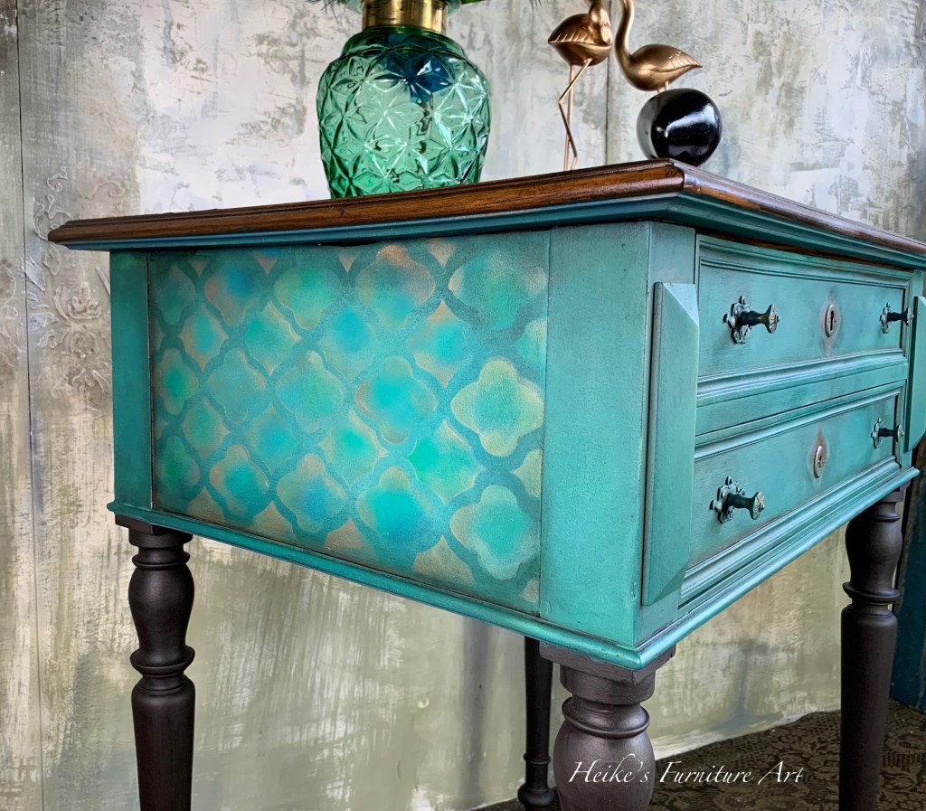
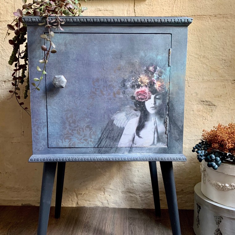
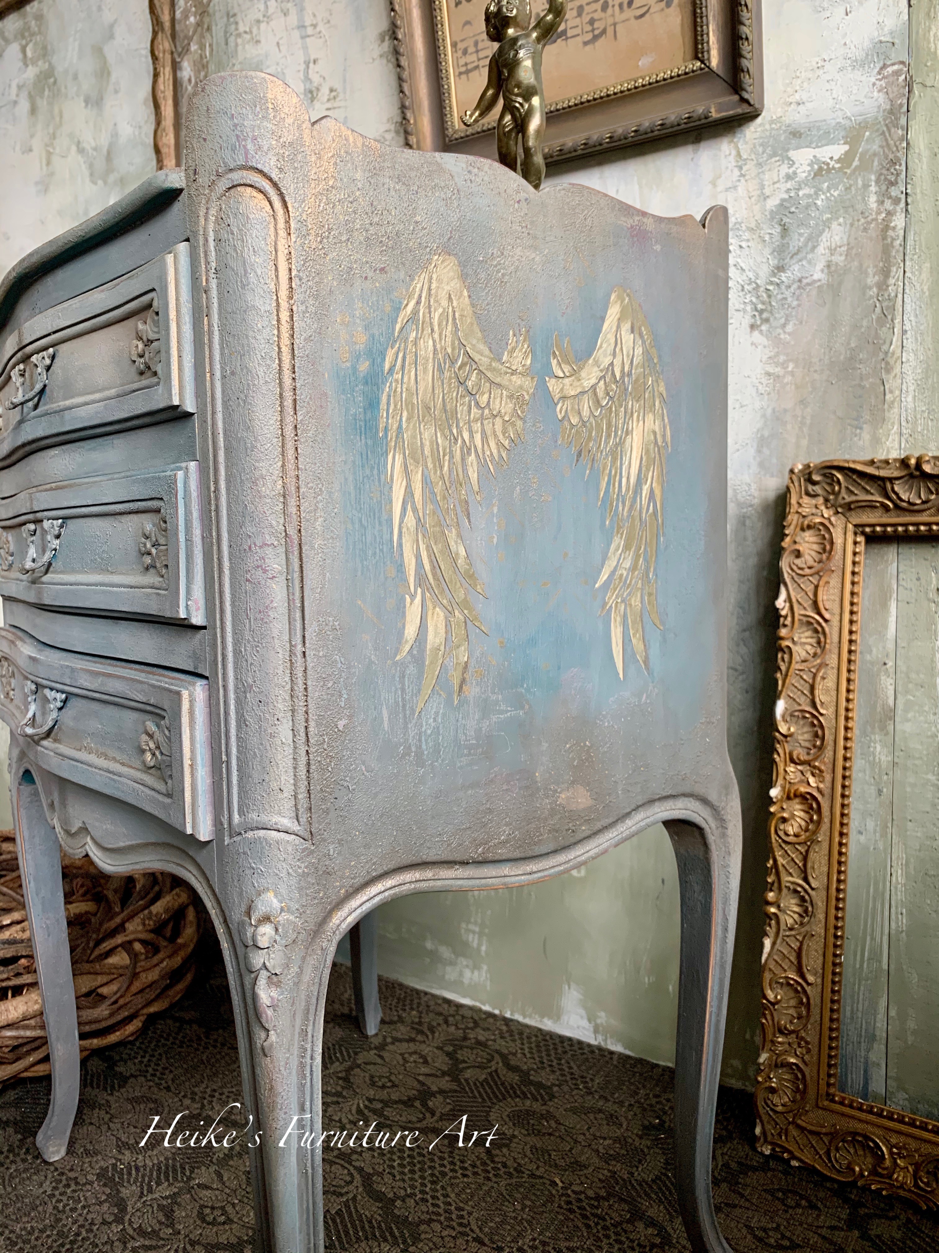
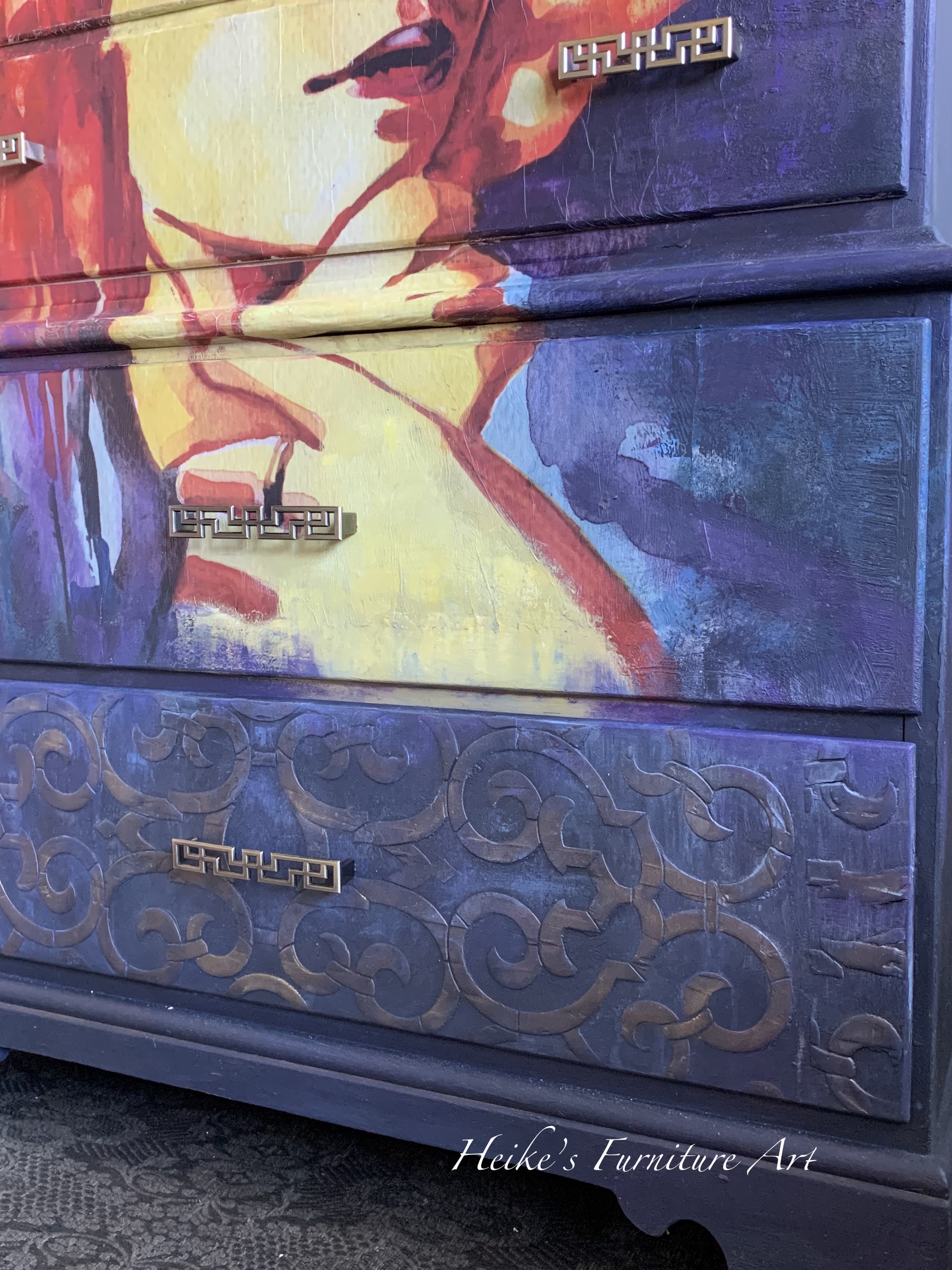
Some of my colorful pieces I created
Whilst writing these lines and looking through the pieces I’ve done over the last year, I notice I’m regularly drawn to all kinds of shades of blues, turquoises and greens. I guess it means that those colors make me feel good.
The color wheel
Colors that look good together are called a color harmony. Artists and designers use these to create a particular look or feel. You can use a color wheel to find color harmonies by using the rules of color combinations. Find the colors that create a pleasing effect.
You can find these color wheels for example on Amazon.